Generating excitement for one of London's most exciting public and commercial spaces.
We created a brand identity for a property-marketing campaign to inspire new residents to the up-and-coming area of London.
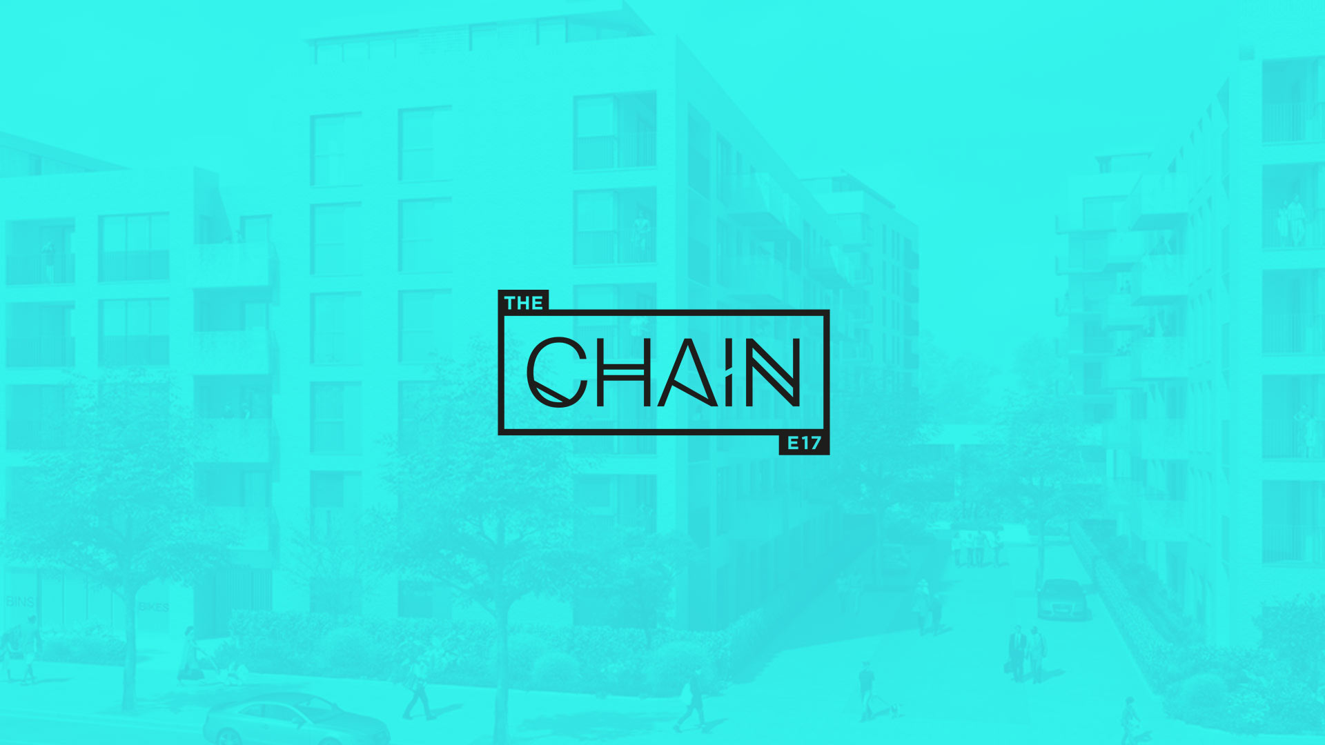
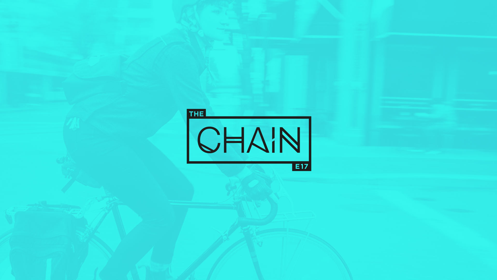
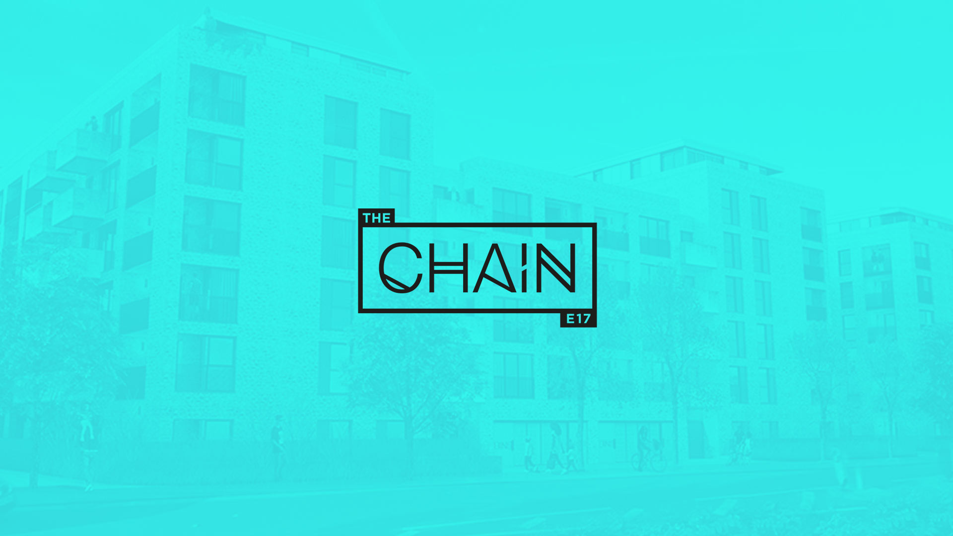
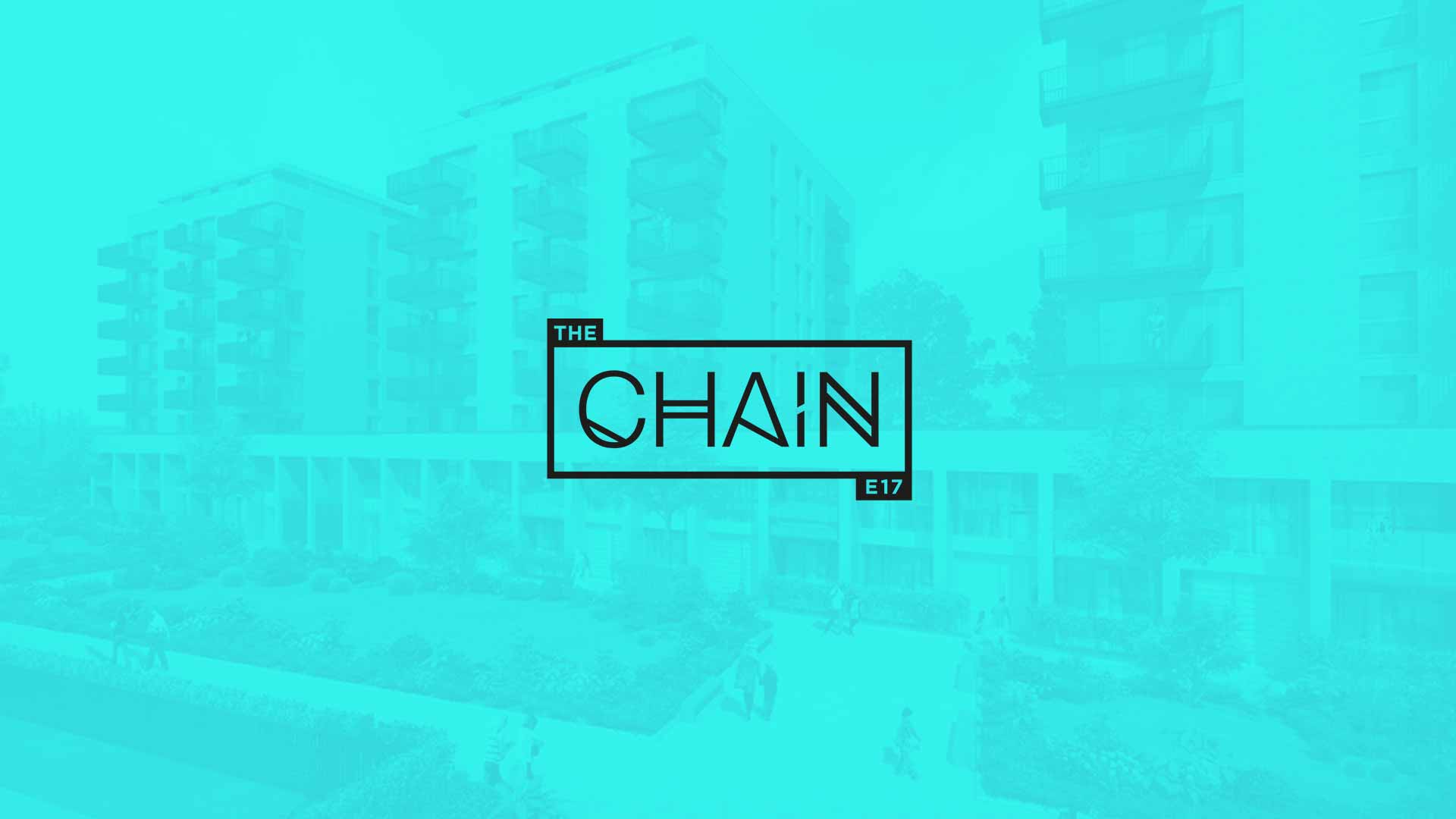
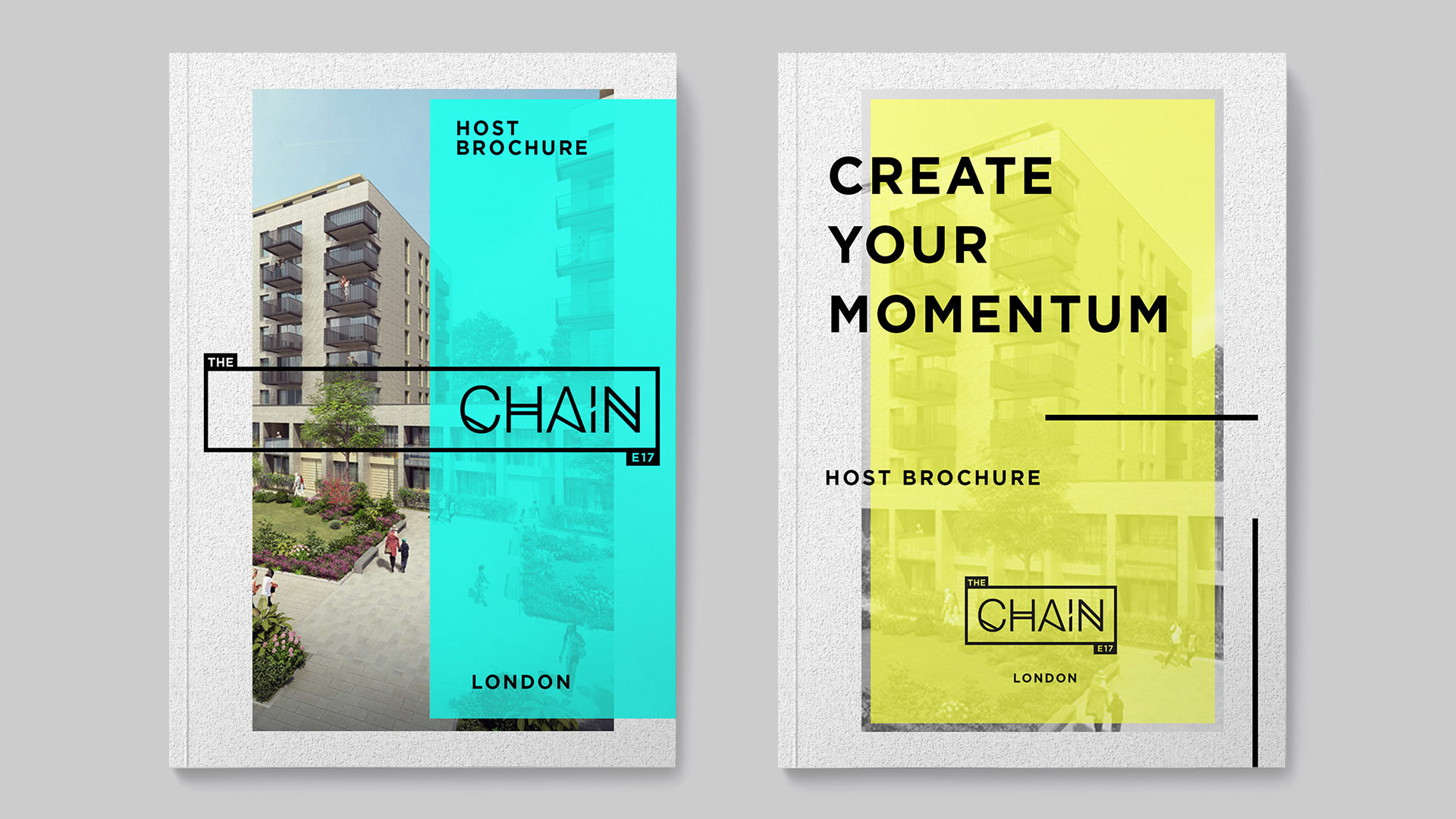
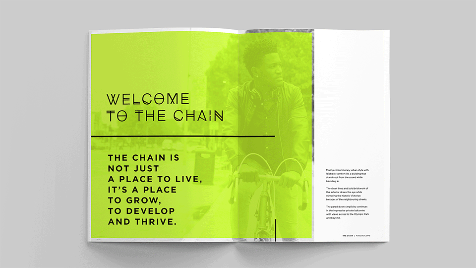
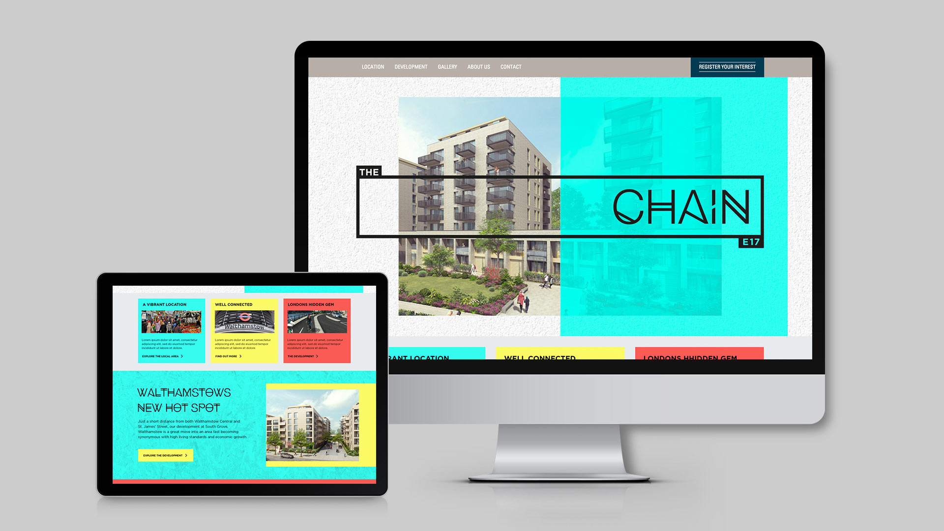
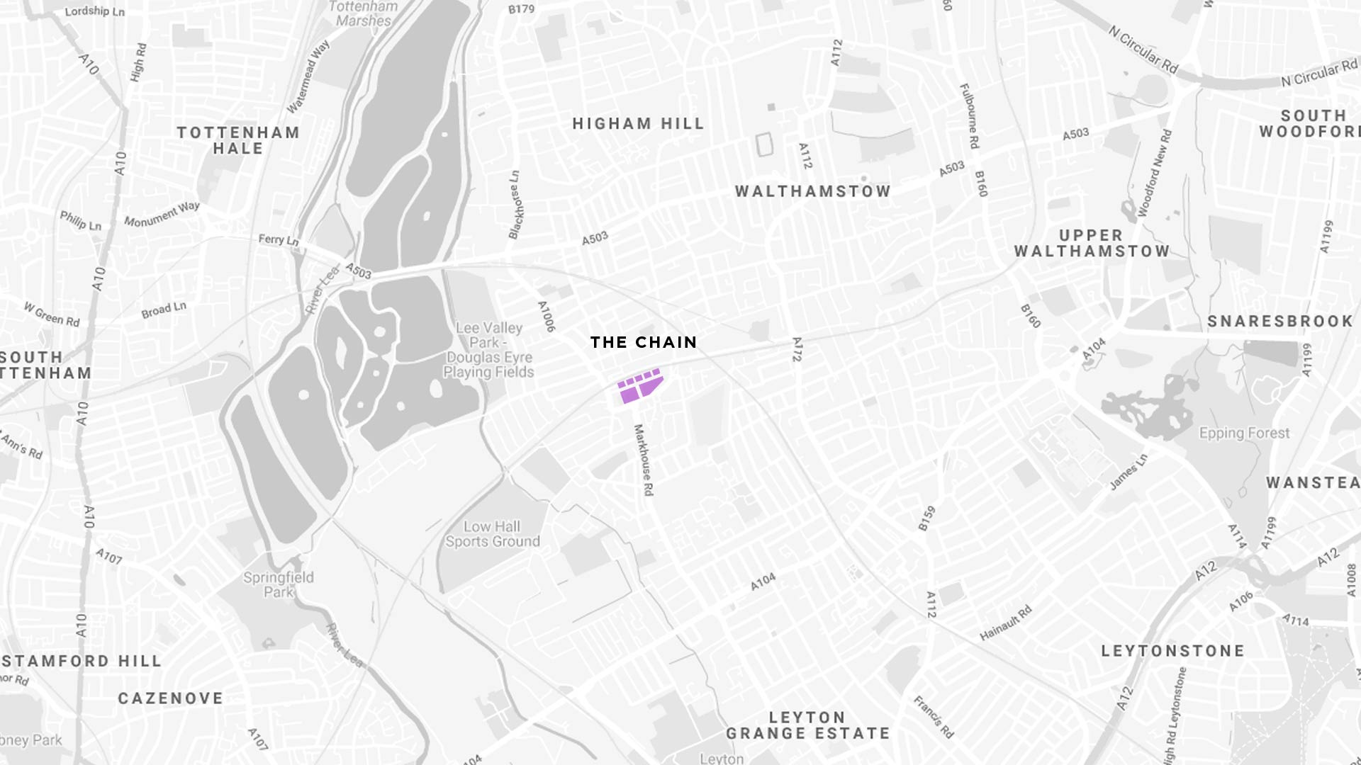
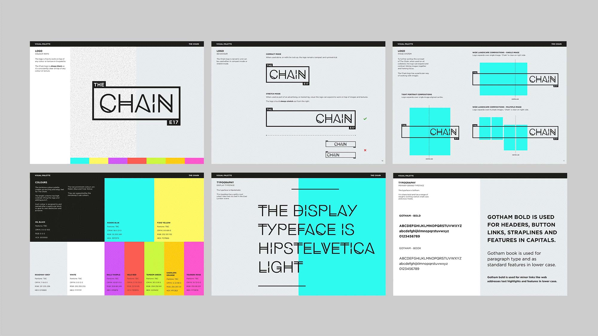
The Chain.
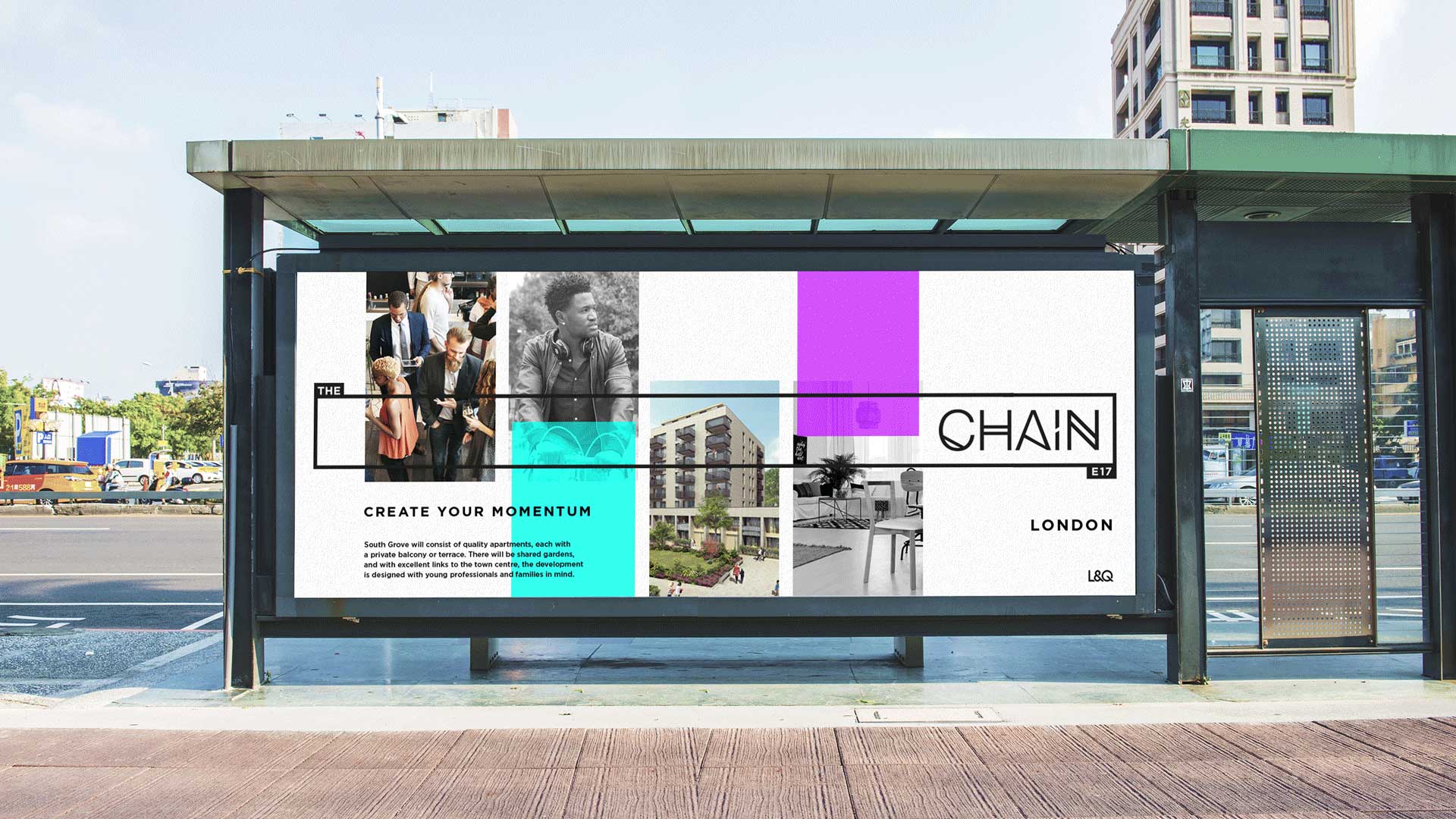
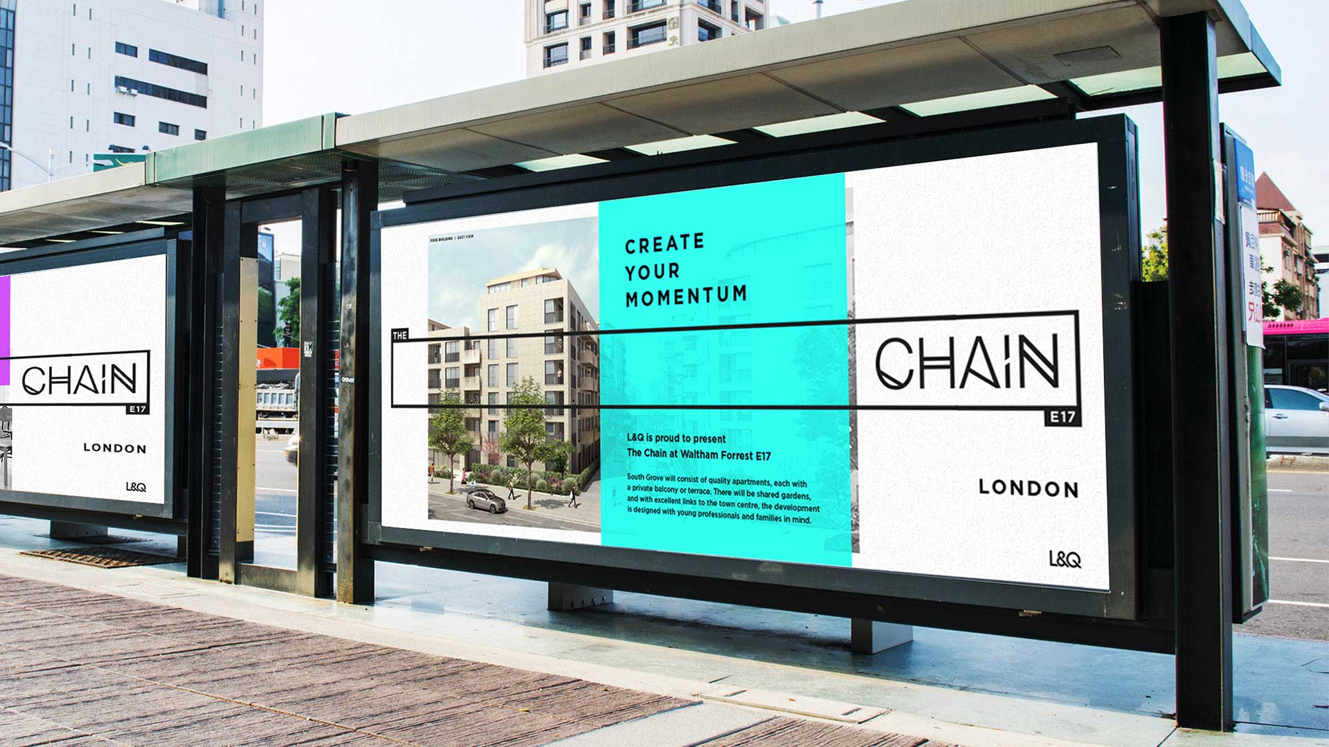
Create Your Momentum.
Strategy / Branding / Property marketing
Challenge.
We needed to create a logo and visual brand identity for a marketing strategy to introduce a retail space in East London to potential businesses with the aim to generate viewings.
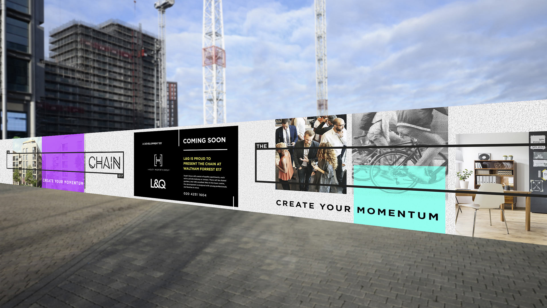
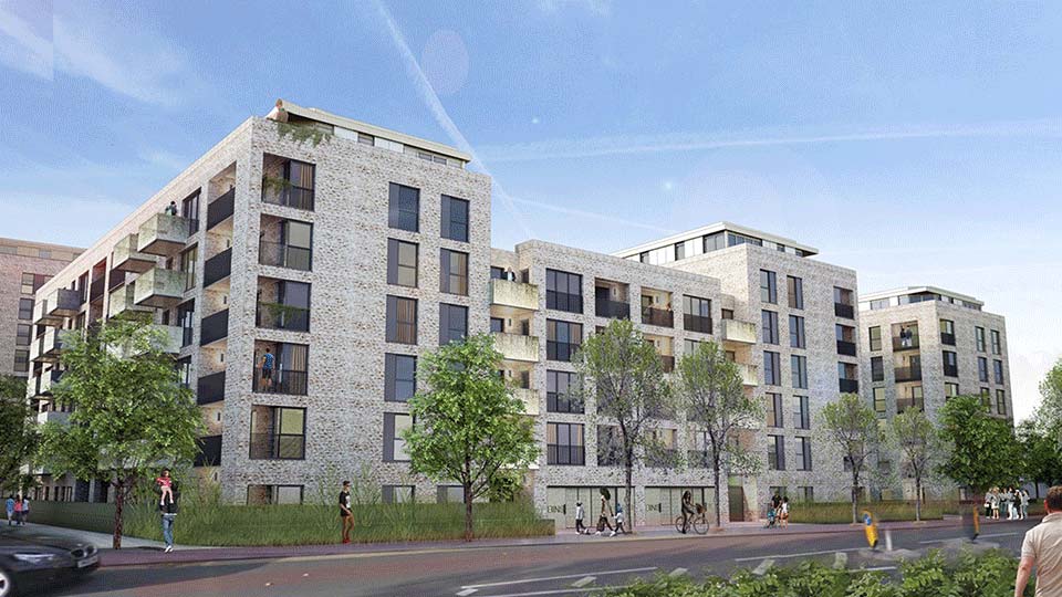
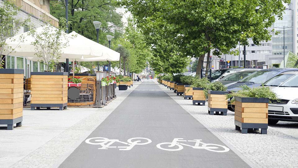
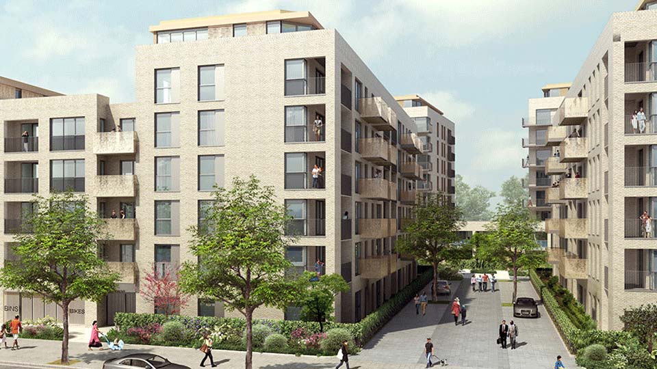
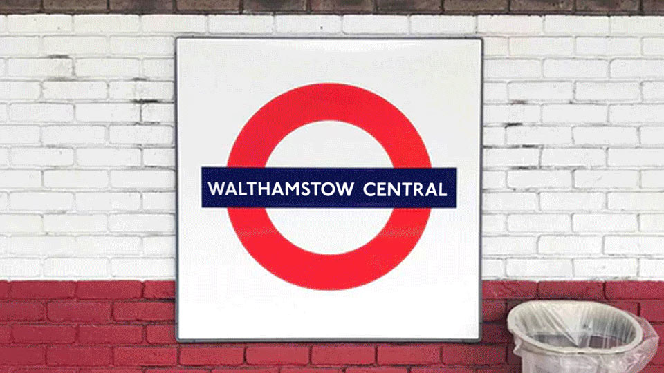
L&Q group were granted planning permission for 473 new homes on Southgrove site Walthamstow town centre in 2017. The plan also includes 2,786 square meters for a new public and commercial space which is hoped to become a cycle cafe.
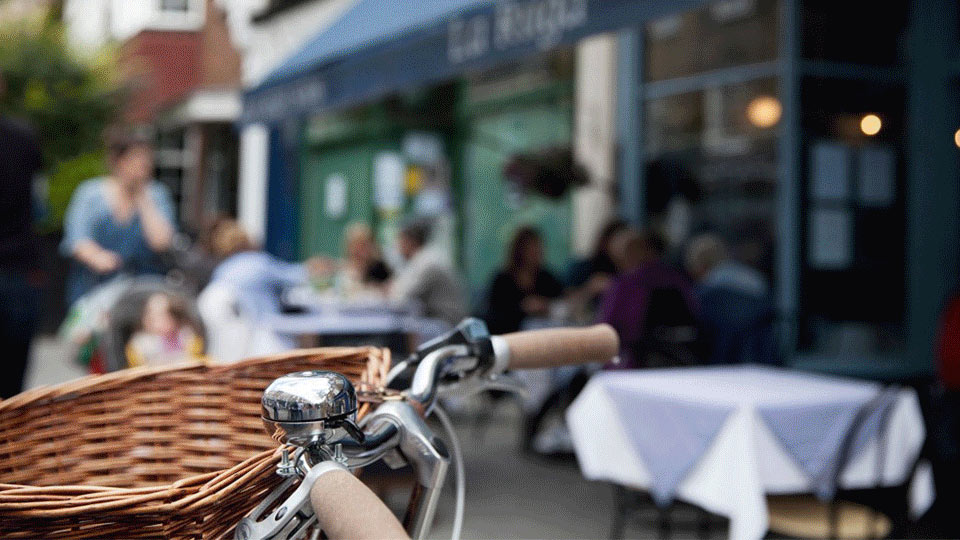
We established a concept that offers a unique connection to Walthamstow celebrating the enthusiasm for cycling in the borough, the up and coming integration of new cycle paths and a planned onsite cycle cafe.
We wanted to create a sense of freedom, proactivity and healthy living around the theme of cycling whilst also promoting the idea of togetherness and connection we want to encourage in the community.
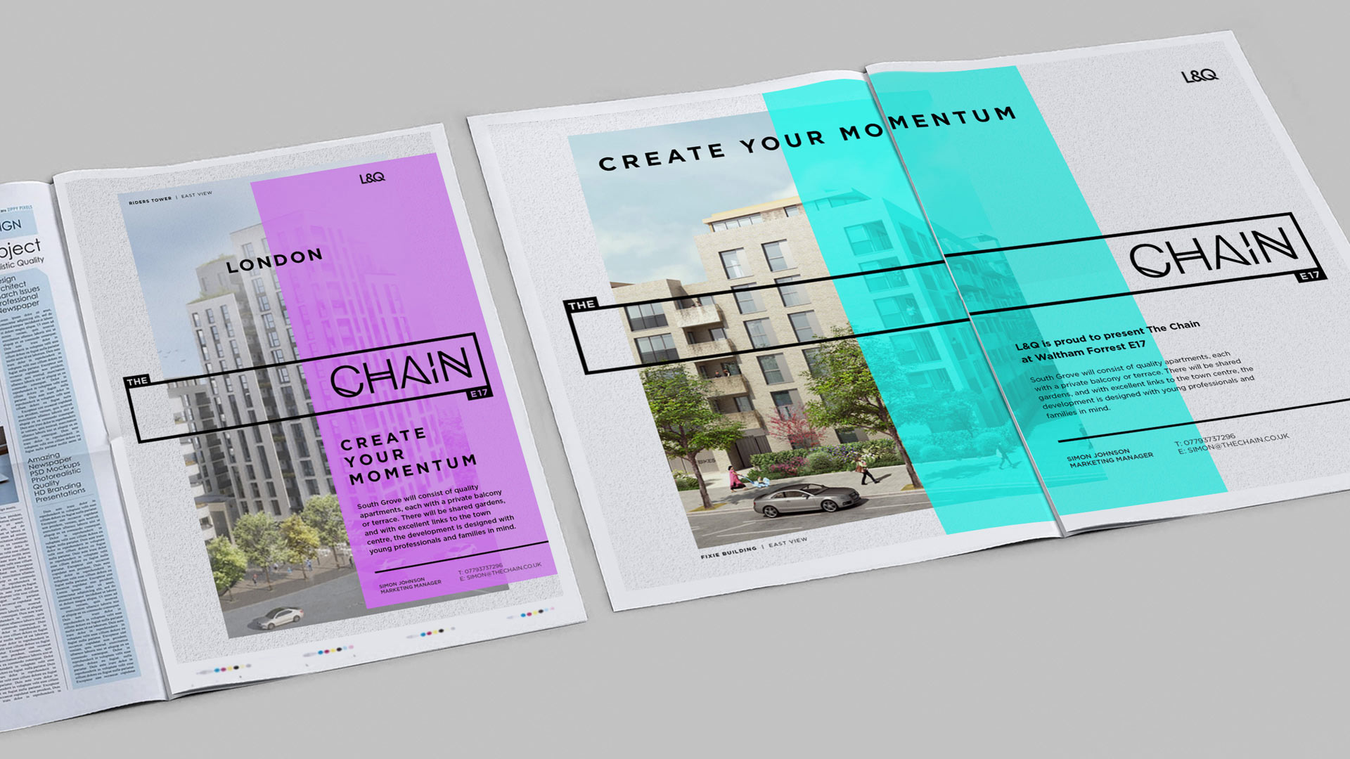
The site will be named ‘The Chain’. The blocks, buildings and streets are named with cycle and urban cycling themes.
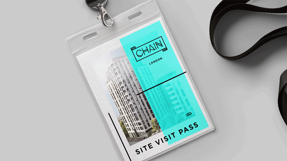
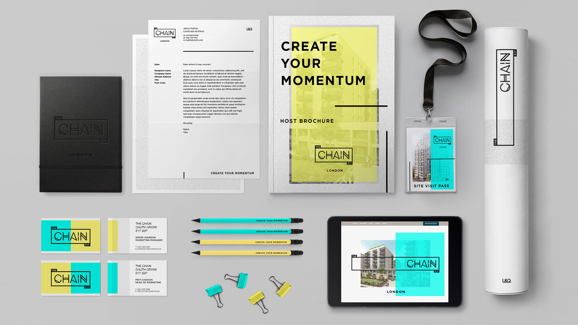
We developed the brand and generate all marketing creative included design across both print and digital for stationery, brochure layout, street hoarding and marketing media collateral such as design for the website and print advertisements.
Adaptive Design
The logo can expand and contract linking visual elements together and frame focus. This dynamic is used to further portray the concept of The Chain.

Adaptive Design
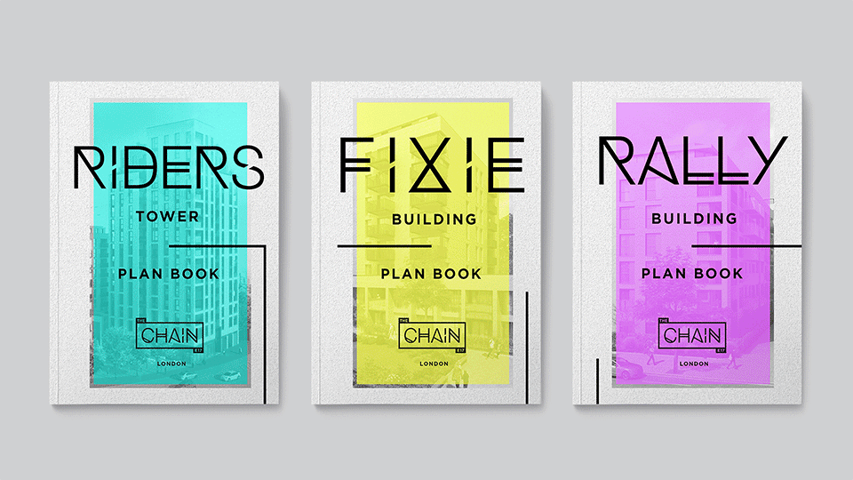
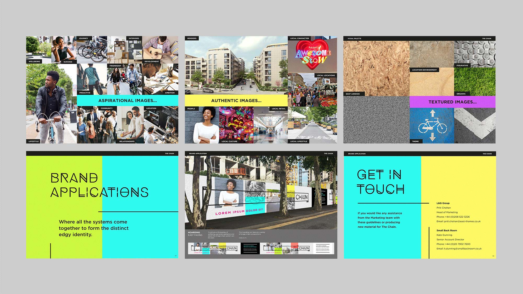
A number of marketing brochures were created for specific blocks on the development.
Adaptive Design
The site will be named ‘The Chain’ and the blocks are named with cycle and urban cycling themes.
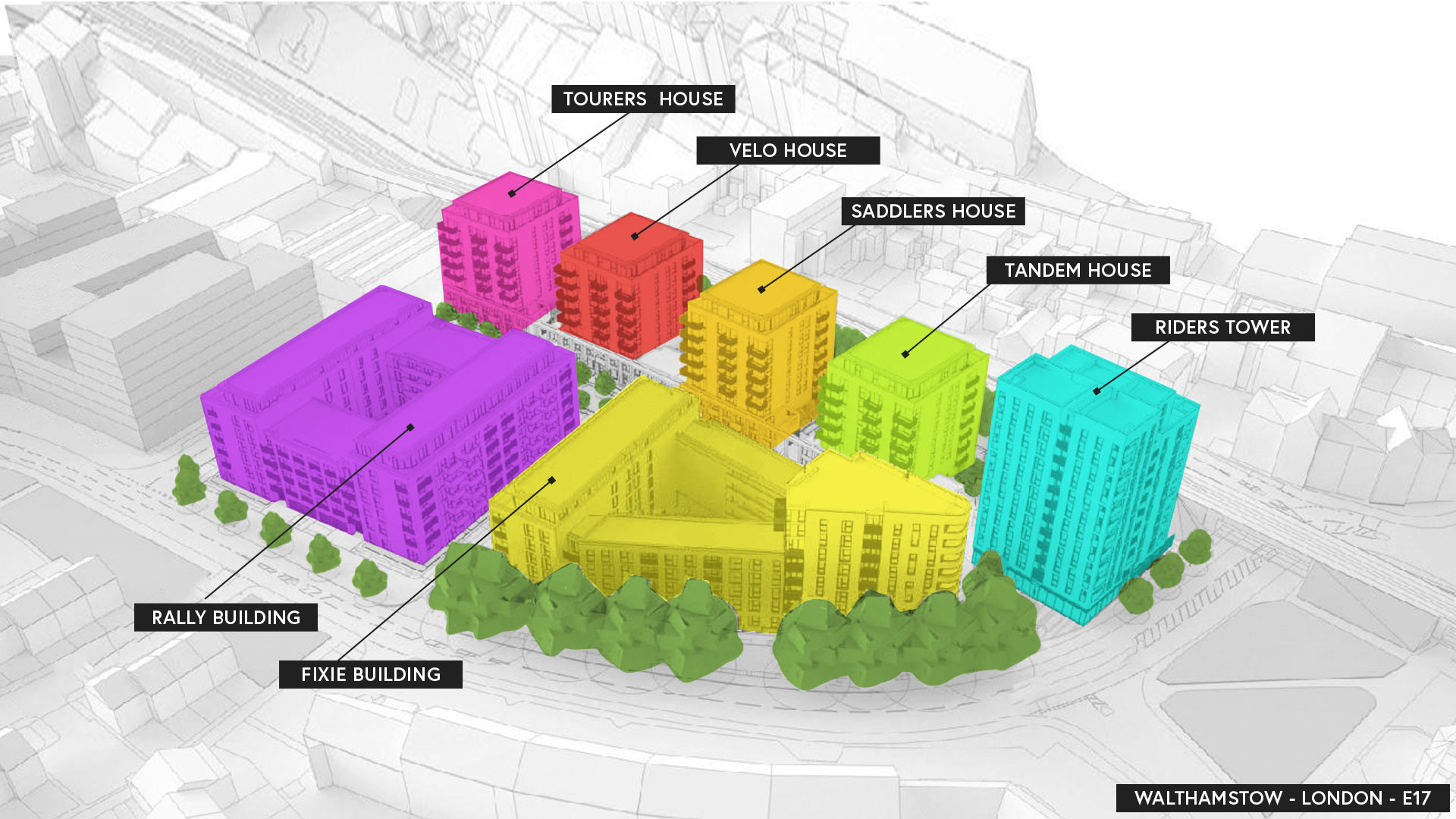
Each building has its own identifiable colour. This system was used to give each block its own character.
A contemporary property-marketing campaign including a logo identity and visual brand that is both bold and dynamic. Designed to appeal to young professionals and families the brand embodies the edgy urban vibe unique to East London.
The visual palette works together to build a vision of aspiration, a life that can be lived at The Chain.


Cardiovascular.
Uniting Experience, Evolving Care.
Bloma.
Remittance App Branding.
Prosus.
Elevating New Business.
Riverside Training Spalding.
Build Your Future Today.
Duel Speed.
20 Years Of Success!
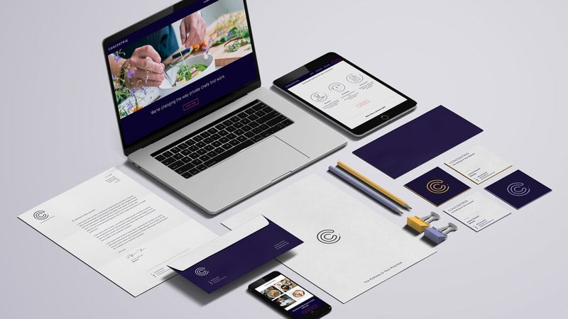
Concentriq
The Pathway To Your Potential.
145 City Road.
Retail Marketing Campaign.

Lena Maye.
Naturally Does It!