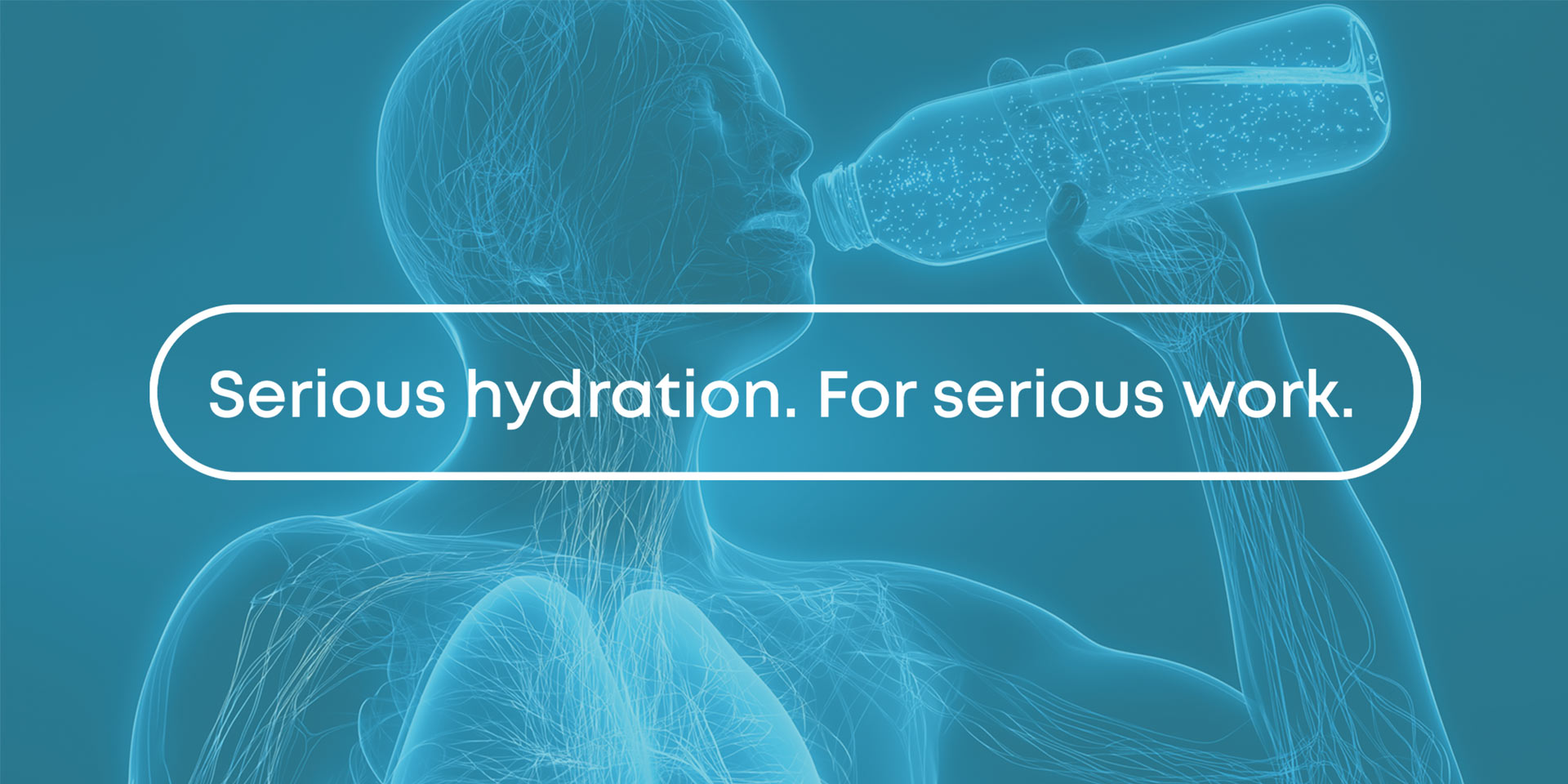
Building a hydration brand for the next generation of hard-working professionals.
We created a bold, grounded brand and packaging system for Terralyte, a hydration drink designed for industrial workers operating in tough, demanding environments.
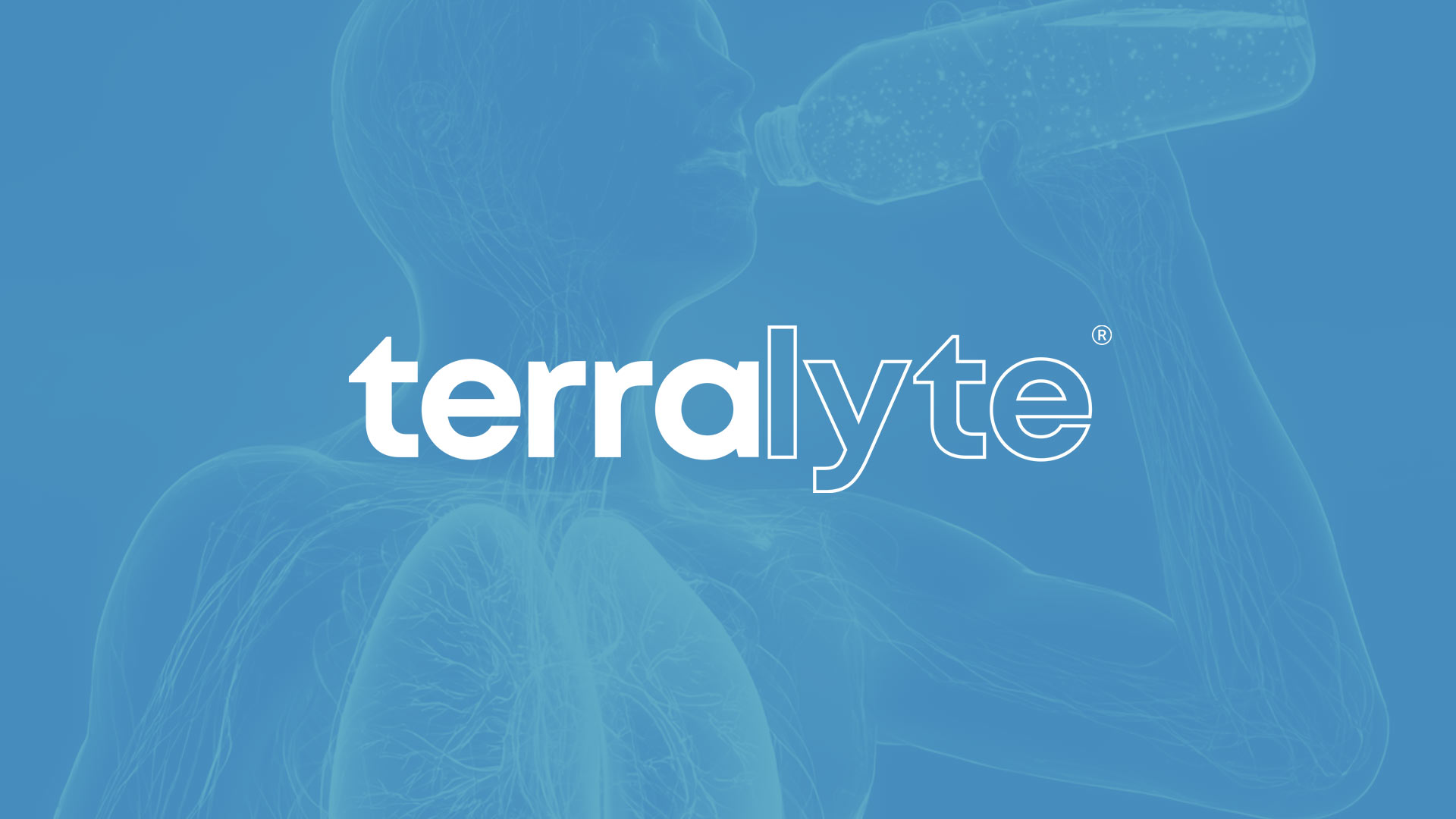
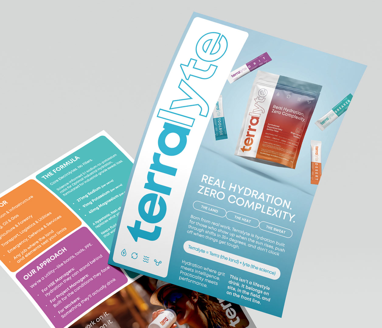
Real Hydration, Zero Complexity.
Terralyte.
Strategy / Branding / Packaging
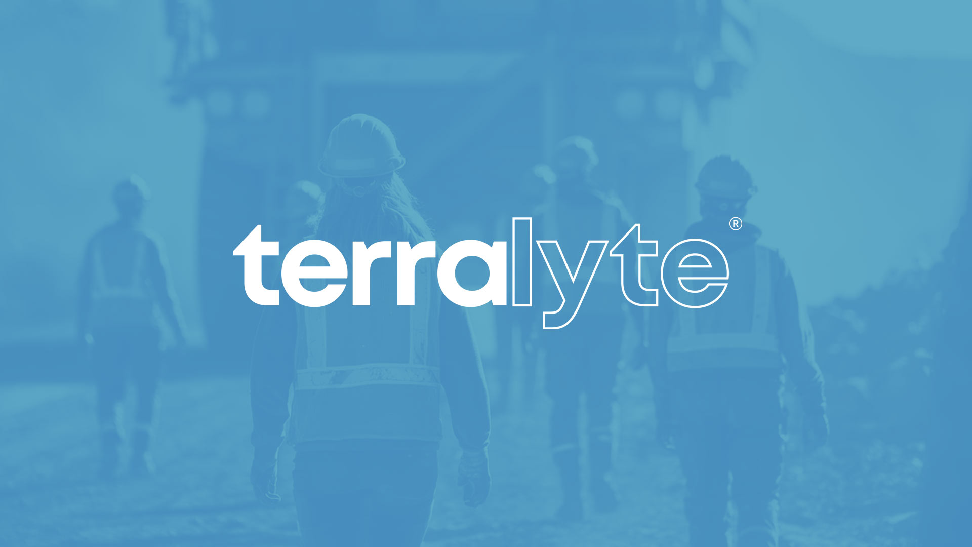
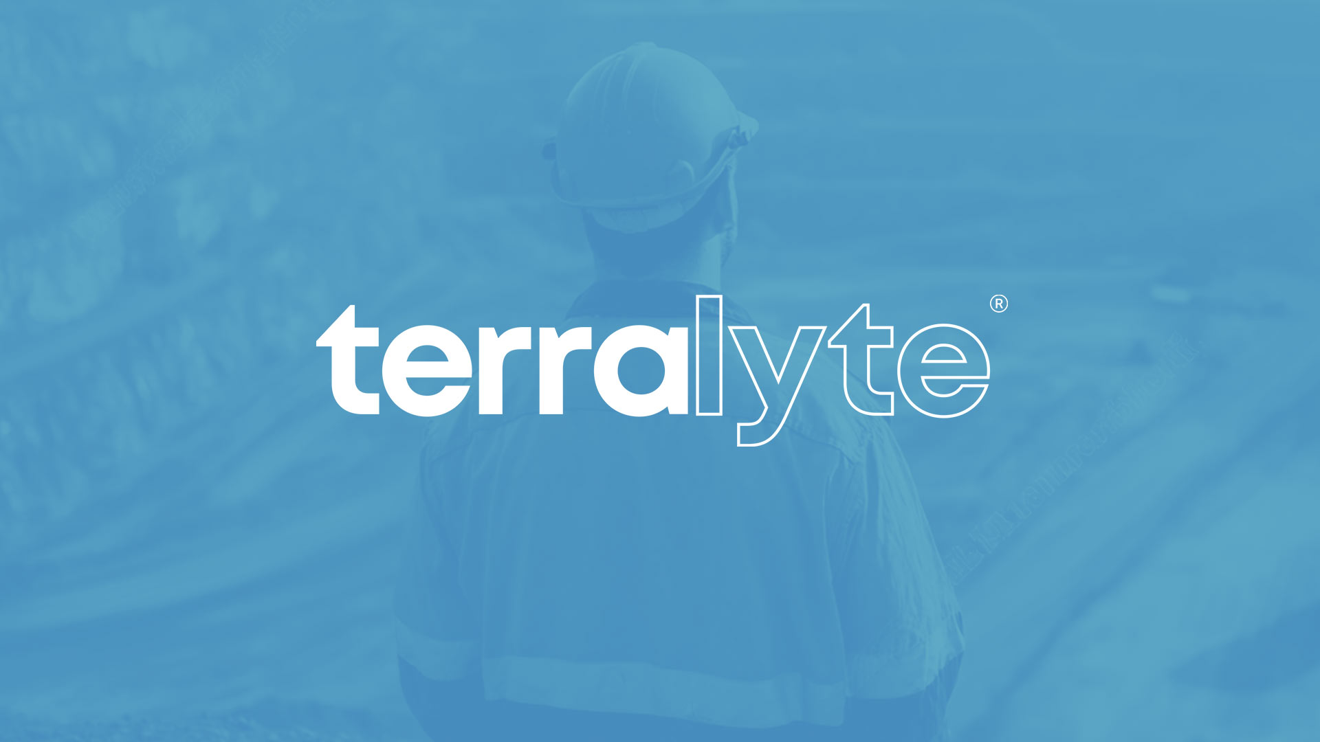
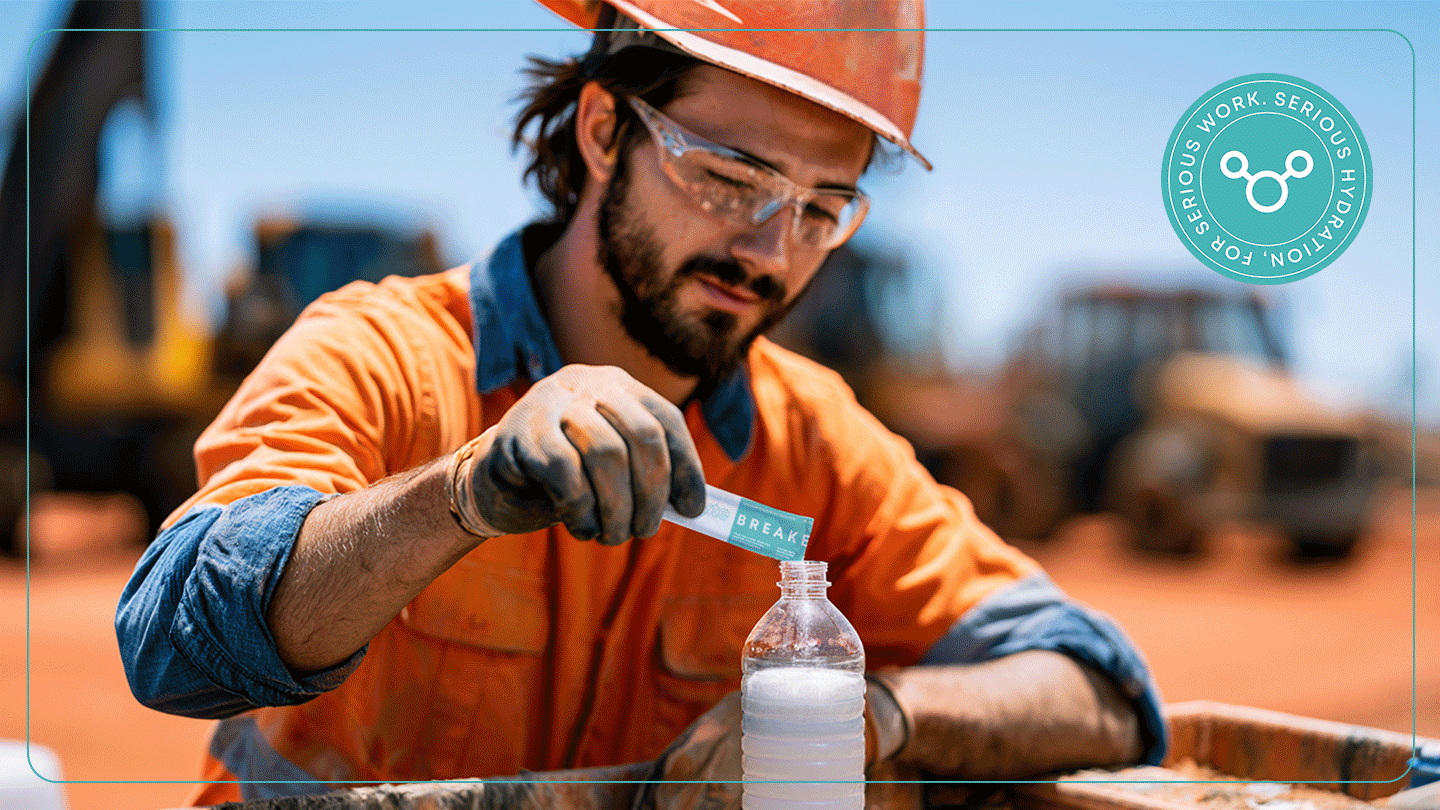
Terralyte needed to enter a competitive hydration market with a product created specifically for industrial workers, including miners, engineers, surveyors, and tradespeople.
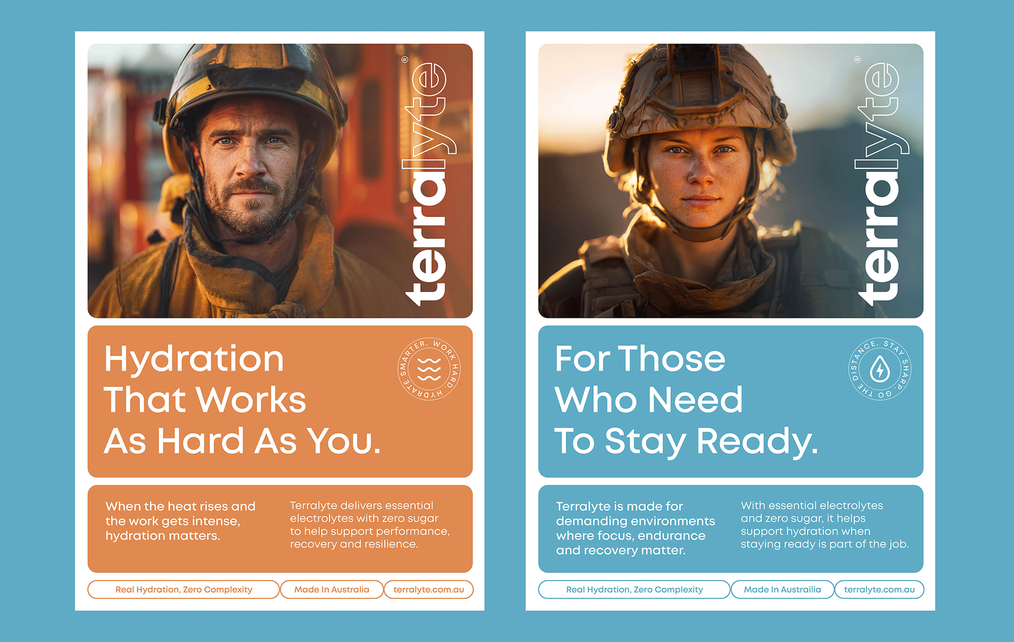
The challenge was to create a brand that felt practical, trustworthy, and science-backed, while avoiding the clinical look of traditional electrolyte products or the loud, hyperactive style of sports drink brands.
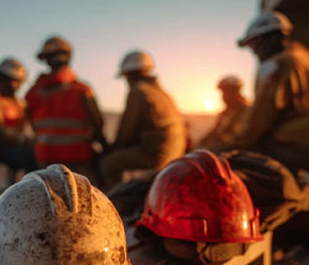
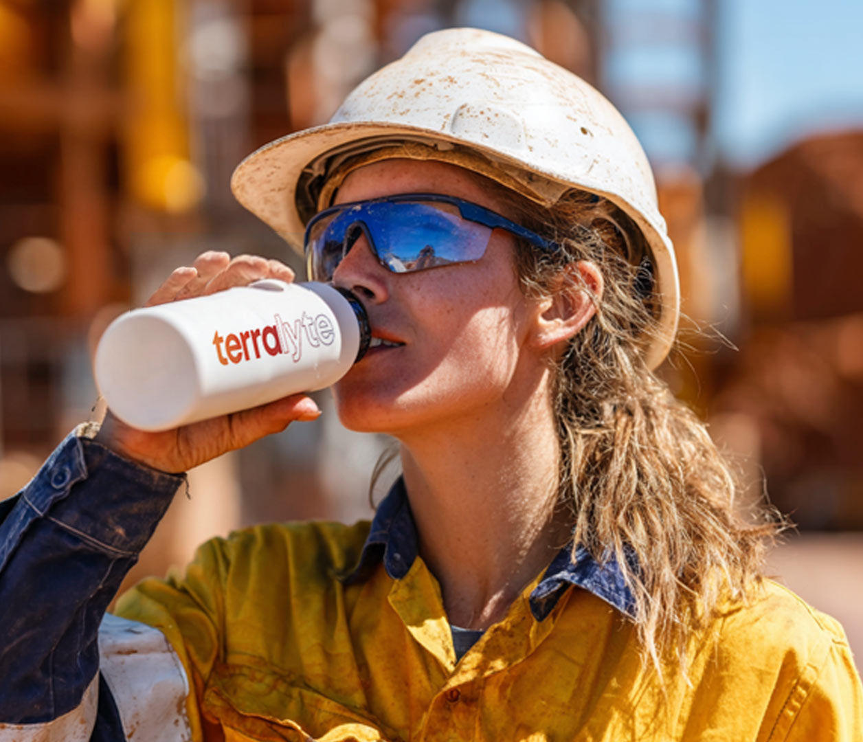
The product was built for real working conditions, so the brand needed to feel connected to the land, the environment, and the people who work in it.
We developed a creative direction inspired by earthy terrain, mineral tones, industrial landscapes, and the resilience of the Australian outback. The goal was to create a visual identity that felt strong, modern, and mature, while still having enough energy to stand out on shelf.
This led to a brand world that balanced utility with impact, using bold colour, grounded textures, and a confident tone of voice to position Terrolyte as hydration built for the job.
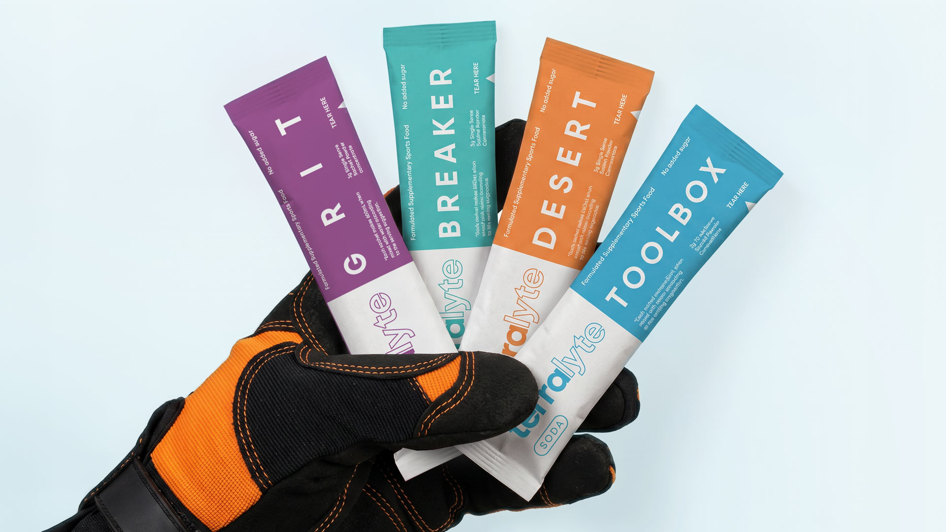
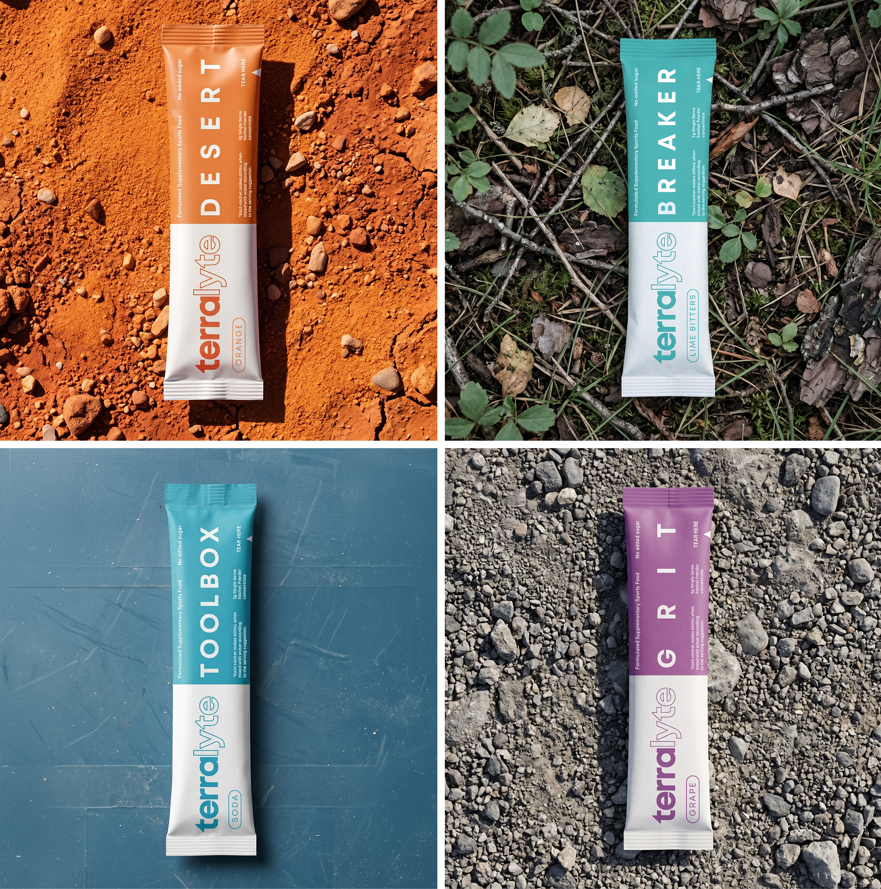
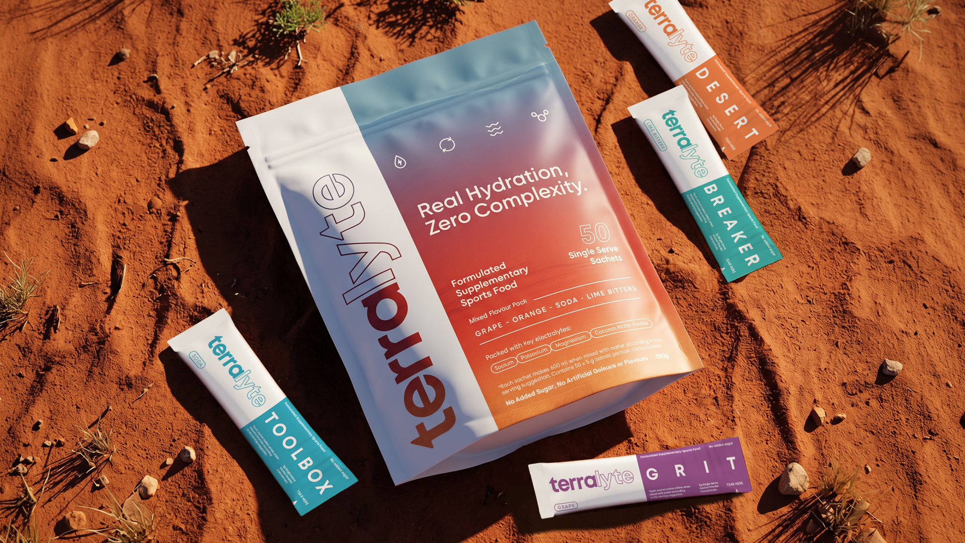
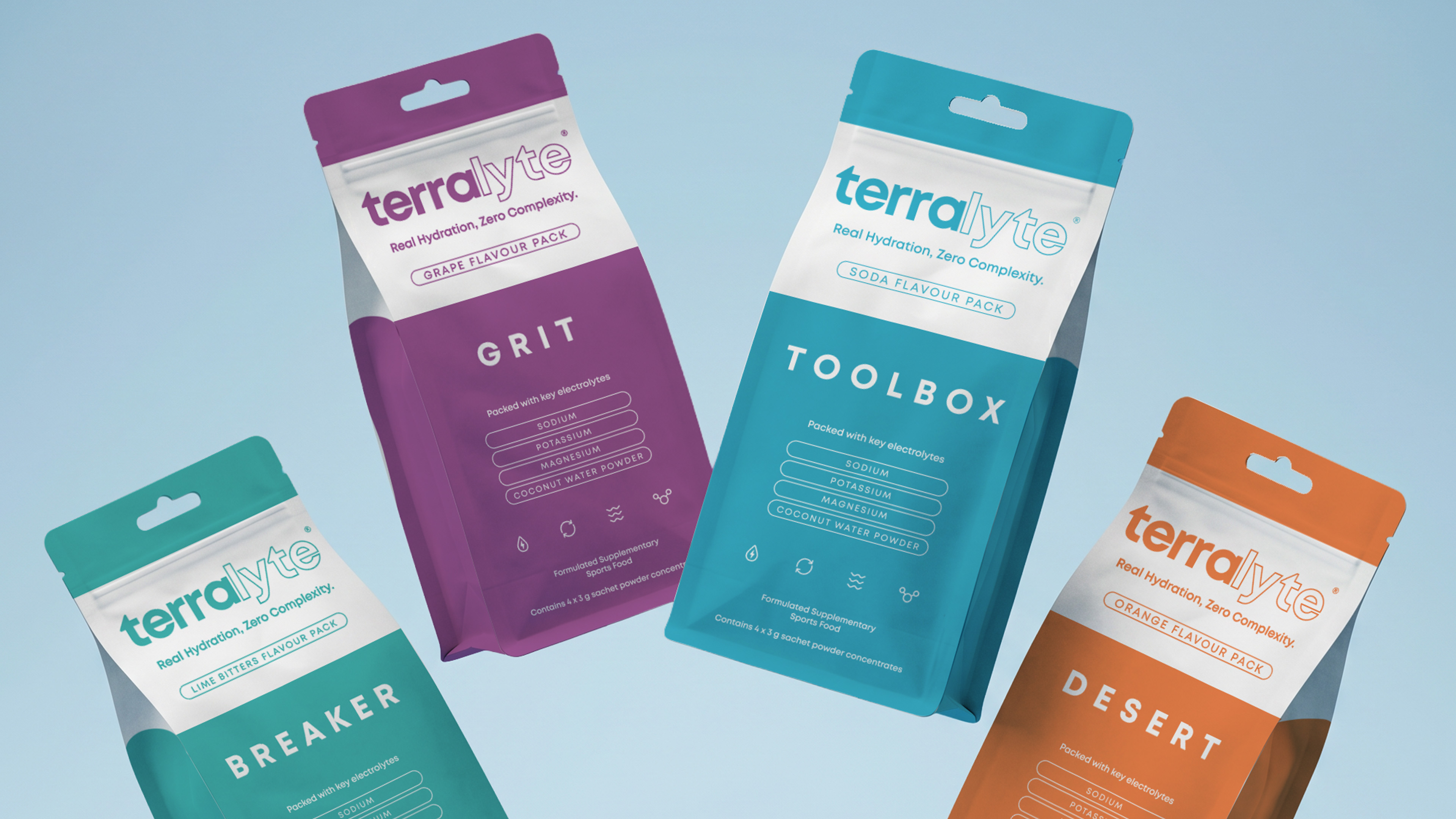
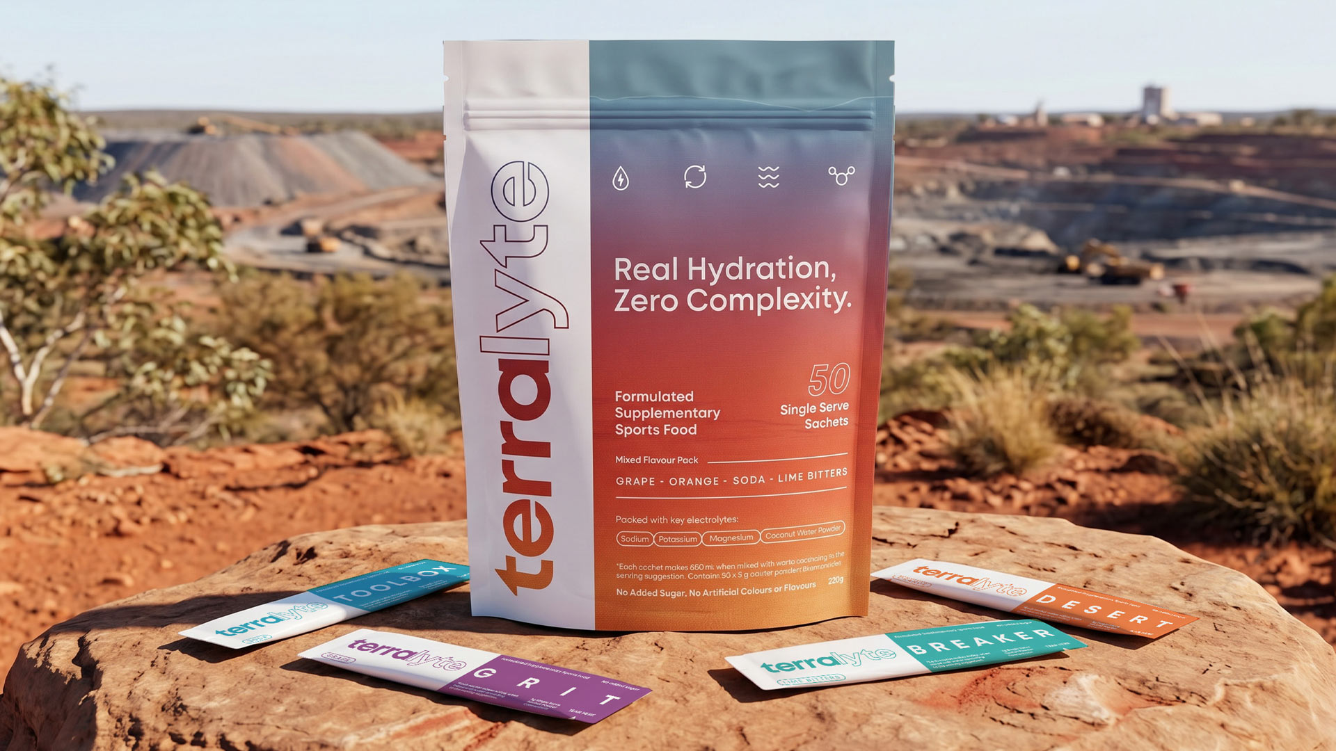
We developed a complete brand and packaging direction for Terralyte, including visual identity, packaging design, flavour colour systems, messaging, and a broader brand language.
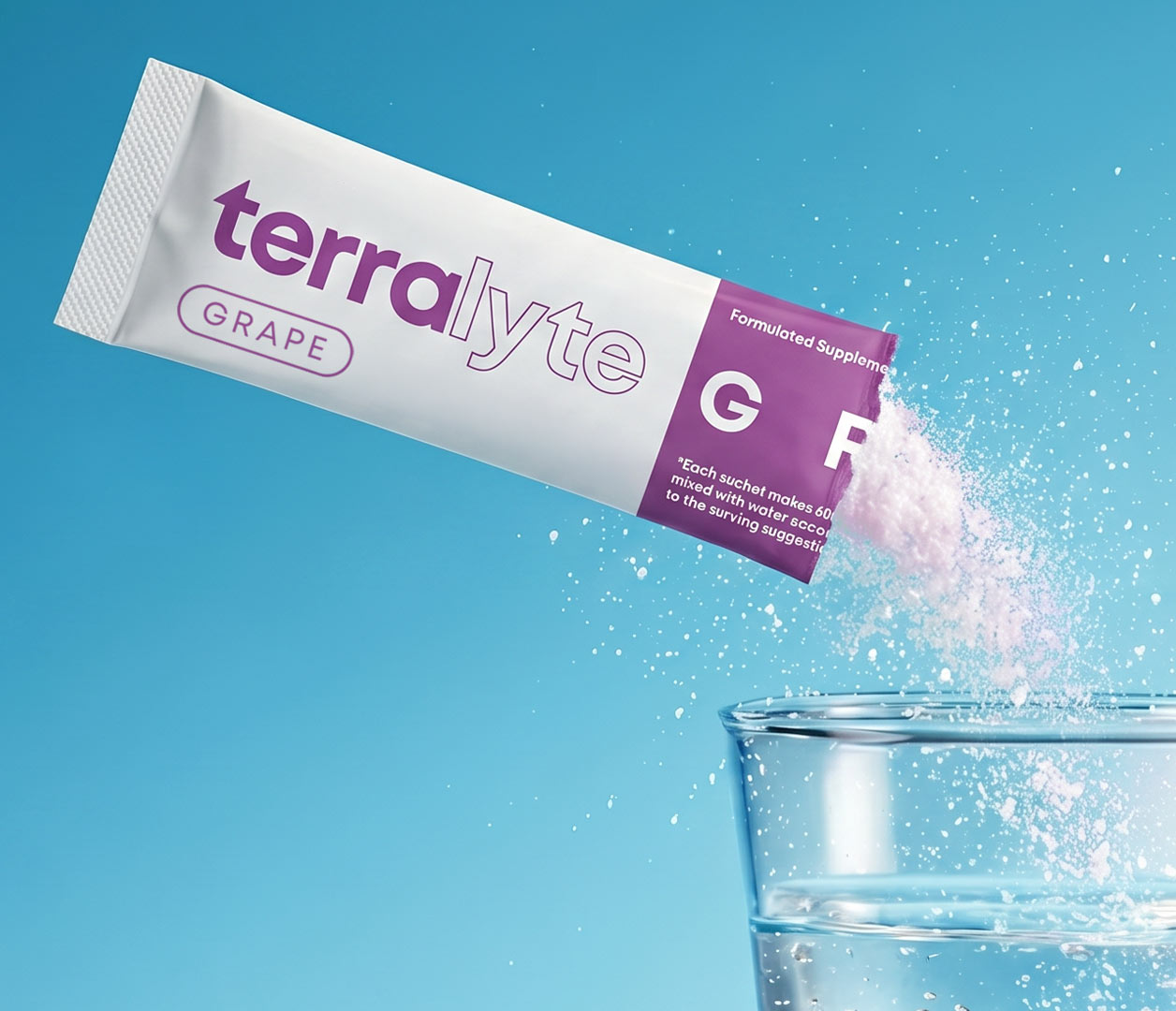
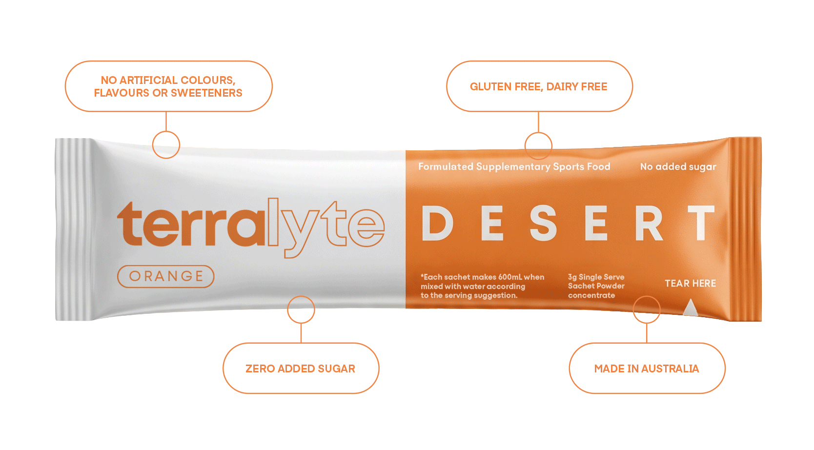
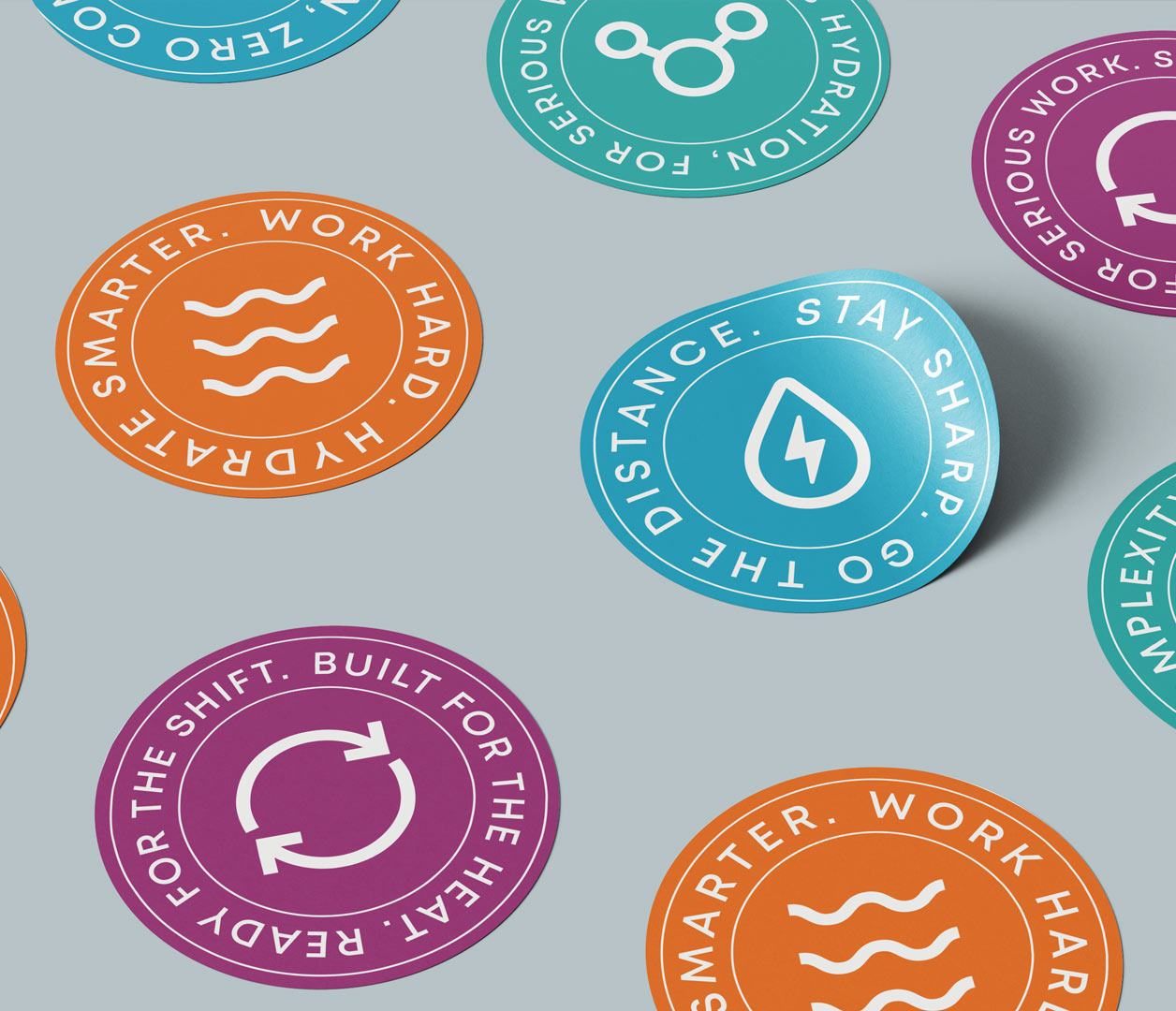
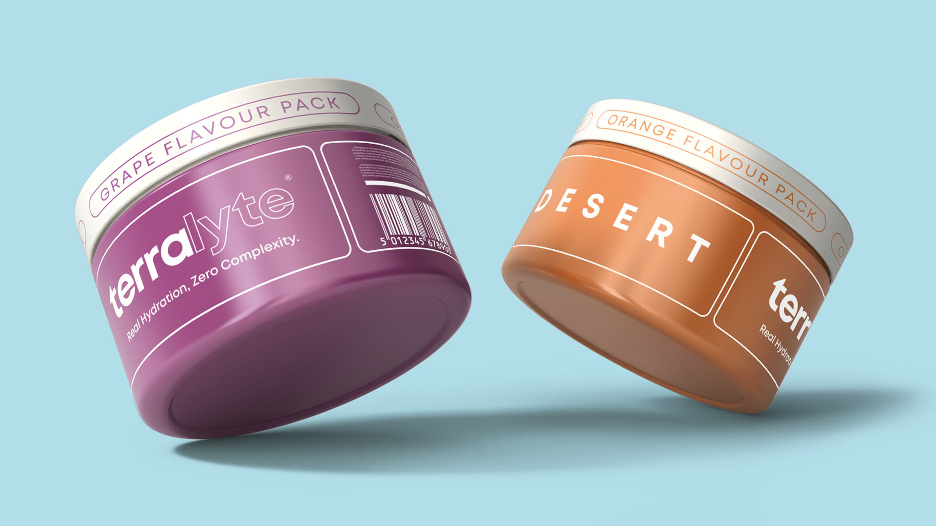
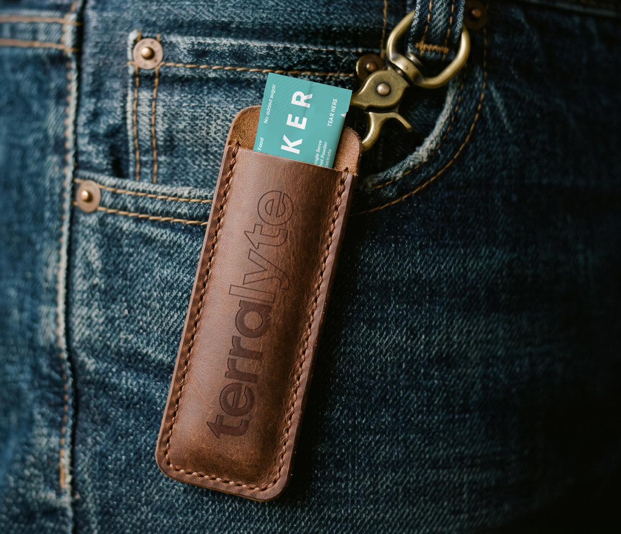
The packaging was designed to feel distinctive and ownable, with each flavour given its own colour and character while remaining part of a consistent system.
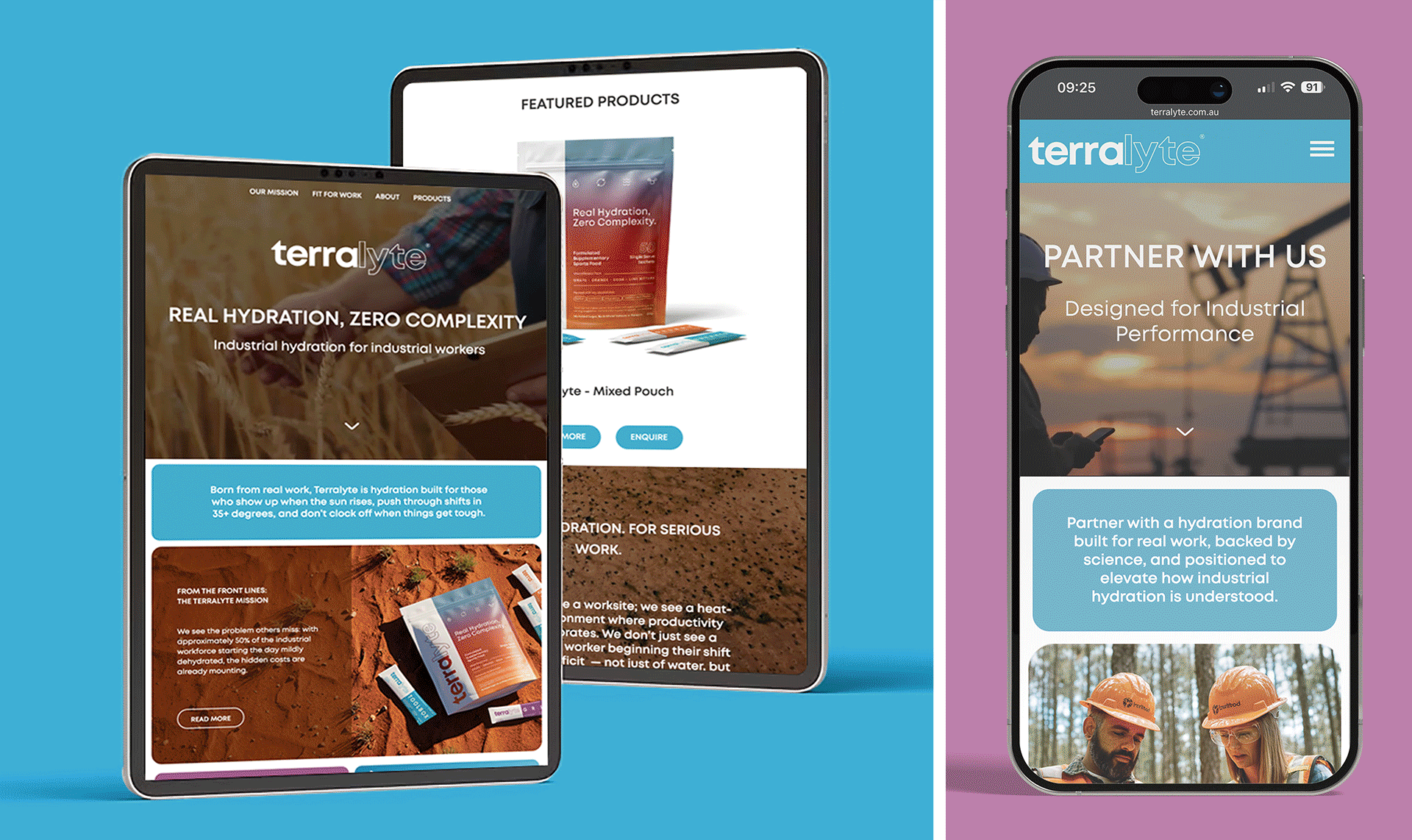
Alongside the brand identity and packaging, we developed a digital experience to support Terrolyte online.
The website was designed to clearly communicate the product benefits, brand story, and flavour range through a clean, confident user experience.
The result is a confident and flexible brand identity that gives Terralyte a strong presence in the hydration category.
With a packaging system designed for retail, workplace environments, and promotional campaigns, Terralyte now has a visual language that feels bold, credible, and purpose-built for a new generation of industrial workers.
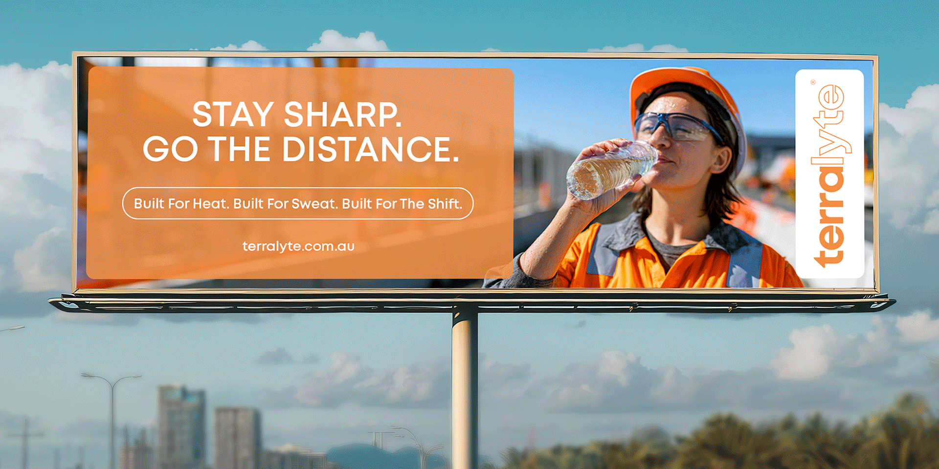
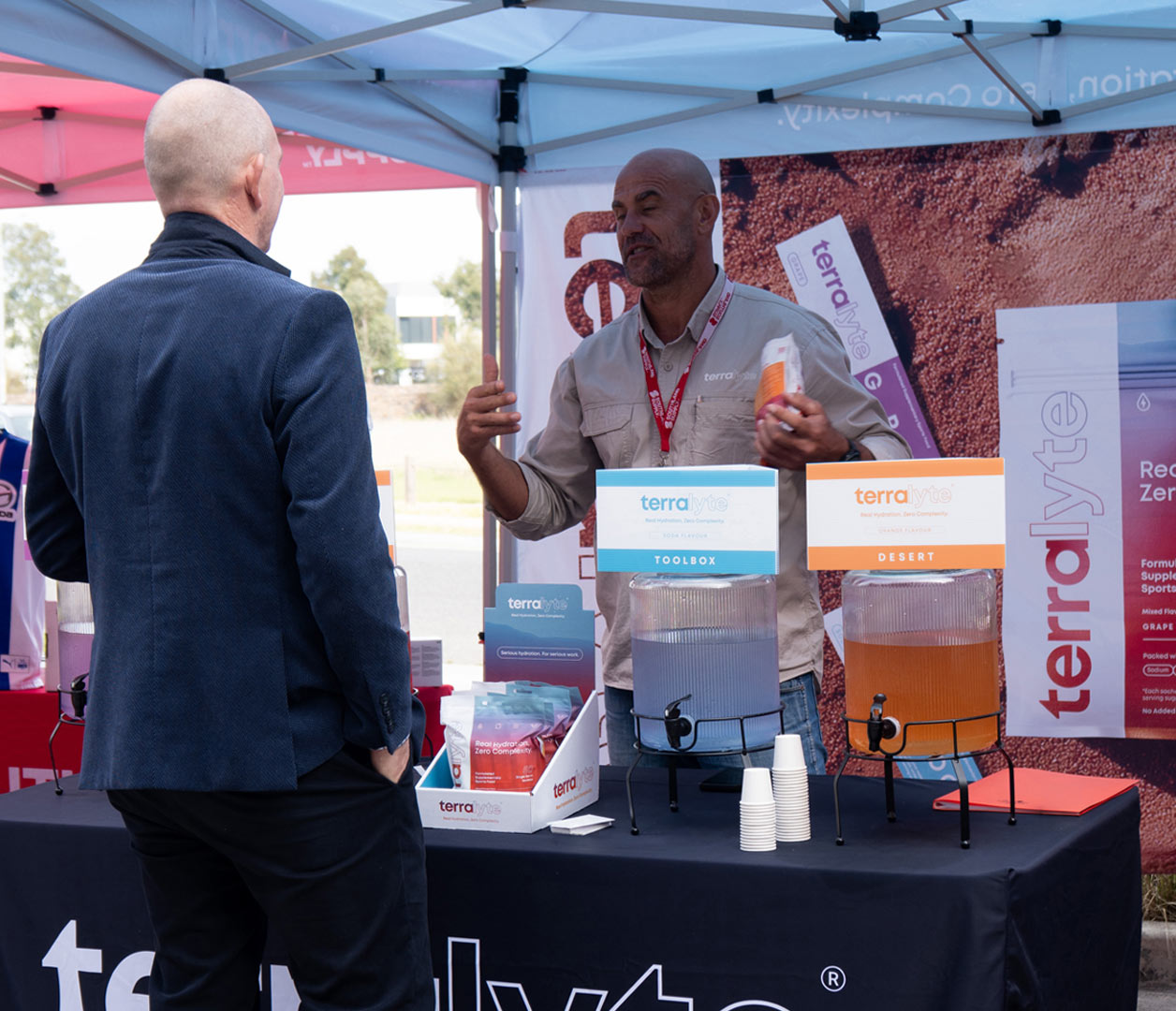
Alongside the brand and packaging, we helped Terralyte translate its identity into real-world exhibition and trade environments.
We designed on-site presentation materials and supporting collateral to help the brand engage workers, communicate product benefits, and create a strong physical presence at industry events.
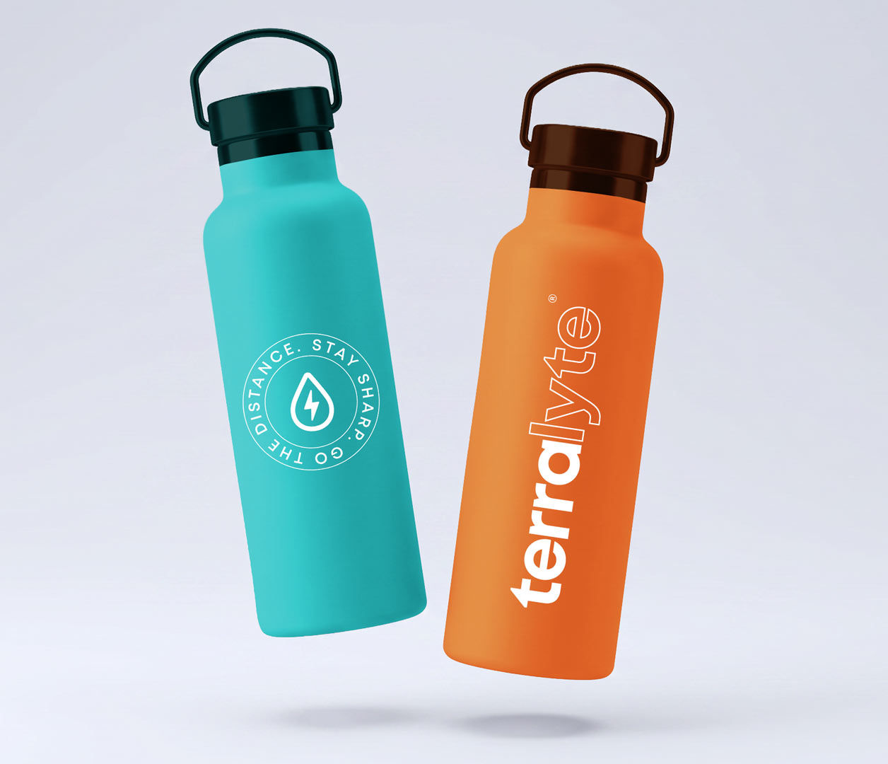
The Terralyte brand was built to feel tough, grounded and ready for the real world. Every element was designed to reflect the environments its audience works in, from the earthy colour system and industrial textures to the bold packaging language and confident tone of voice.
Across packaging, digital and on-site collateral, the identity creates a brand experience that feels practical, distinctive and built with purpose. A hydration brand designed not just to sit on shelf, but to show up in the field, connect with workers and support the people powering tough industries every day.

"BigBang has been a big part of bringing Terralyte to life. From day one, BigBang just got what we were trying to build.
This wasn’t about making something that looked good on a shelf, it needed to feel real, grounded, and built for the environments it’s actually going into.
BigBang nailed that and delivered across the full piece, brand, packaging, website, all the core assets and it’s consistent the whole way through. Clean, strong, no fluff. It looks like it belongs where it should… on site, not in a lifestyle campaign.
What I’ve appreciated most is how BigBang worked as part of the team. Good back and forth, open to feedback, no ego, just focused on getting it right and all done with fast turnaround times.
BigBang has proven to be a really valuable part of what we’re building. Didn’t just design it, BigBang brings it to life."
David Rhodes
Founder & Director


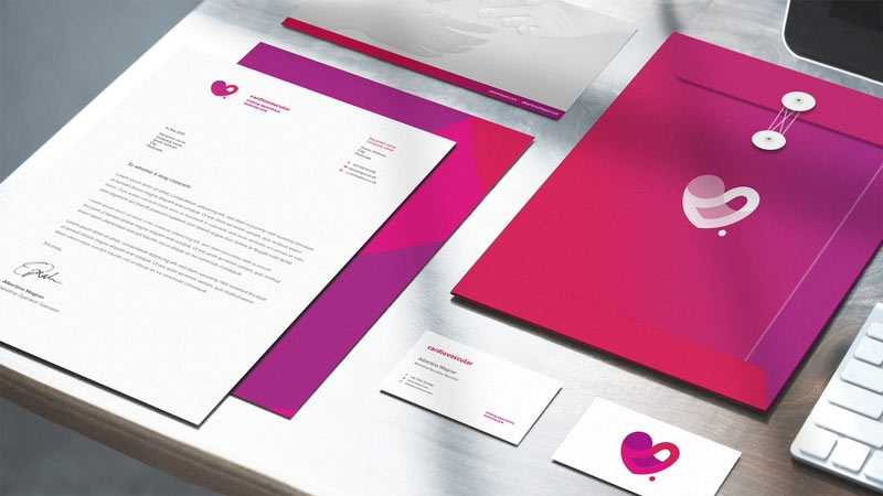
Cardiovascular.
Uniting Experience, Evolving Care.
Bloma.
Remittance App Branding.
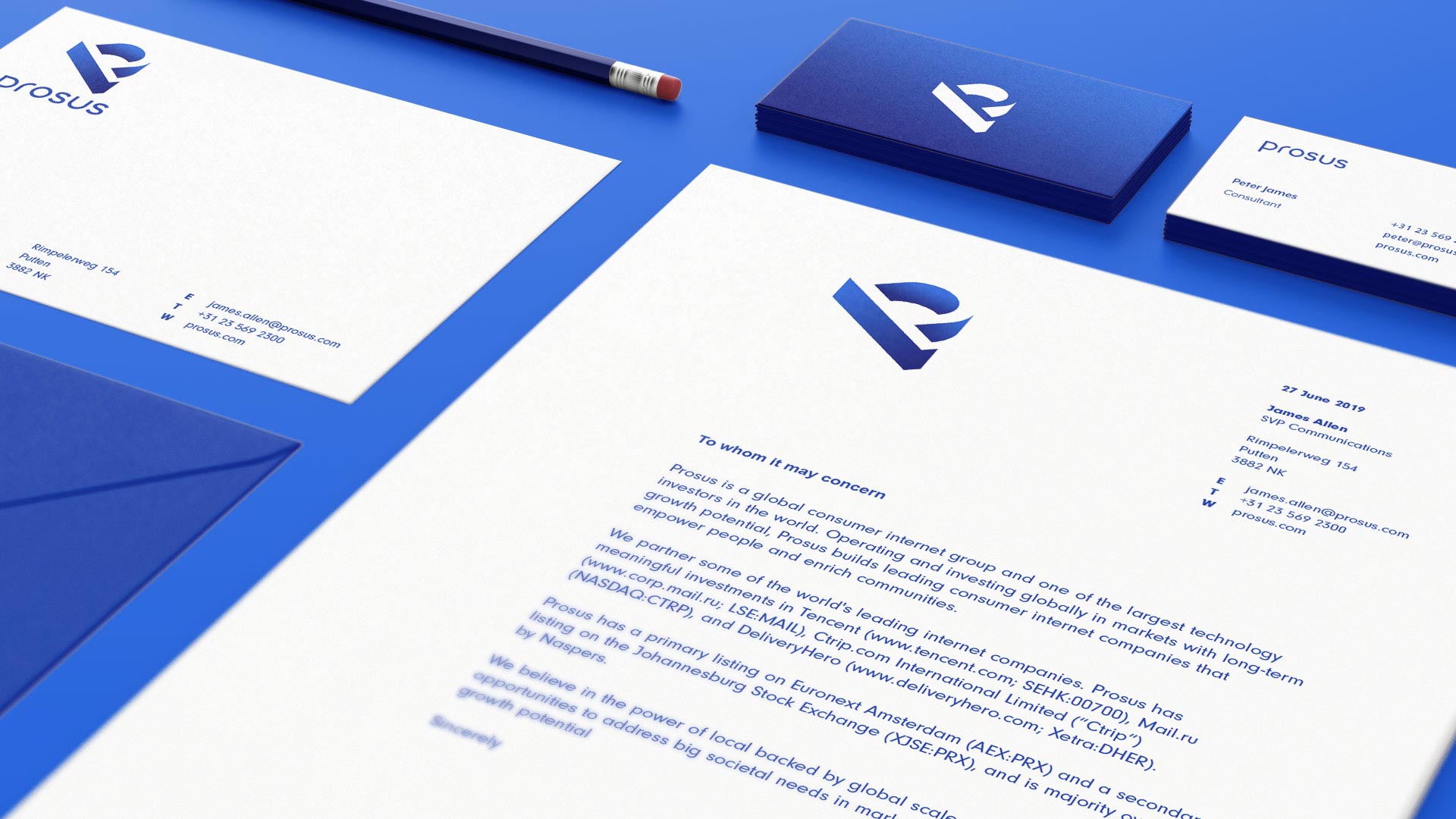
Prosus.
Elevating New Business.
Riverside Training Spalding.
Build Your Future Today.
Duel Speed.
20 Years Of Success!
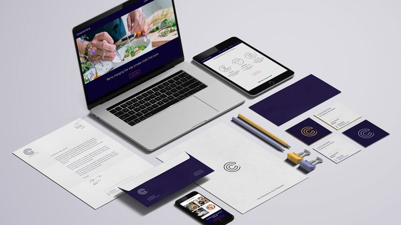
Concentriq
The Pathway To Your Potential.
145 City Road.
Retail Marketing Campaign.

The Chain.
Create Your Momentum.