


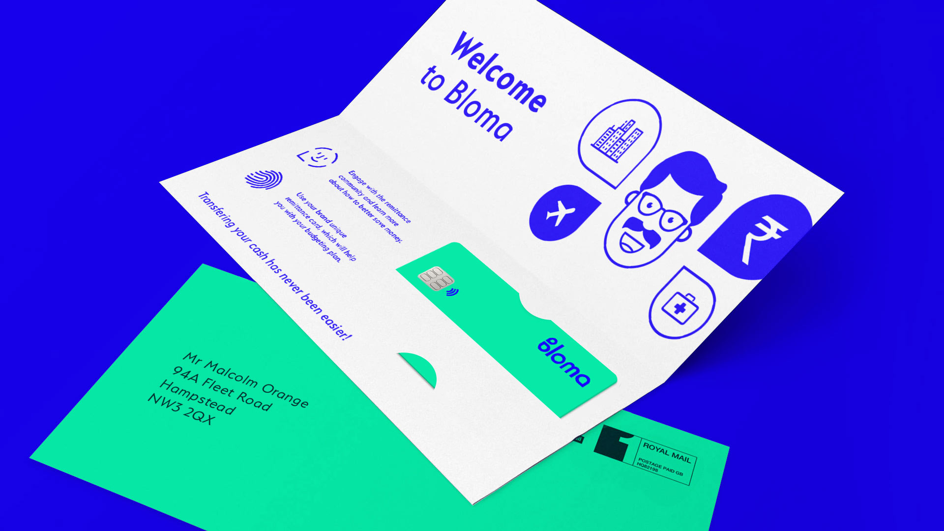
Helping friends and family connect, improve finances and blossom internationally.
We created a bright, uplifting and fresh brand identity for a new app experience.
Bloma.
Improving Family Finance.
Logo design / Branding / Remittance
Challenge.
We needed to develop a logo and brand identity to promote a new remittance app to help friends and family improve their finances.
The app’s USP is to enable friends and family to connect and form communities to offer helpful financial advice and prosper from features offered on the platform.
This led to a idea that would inspire the creative solution around the theme: Communication & growth.
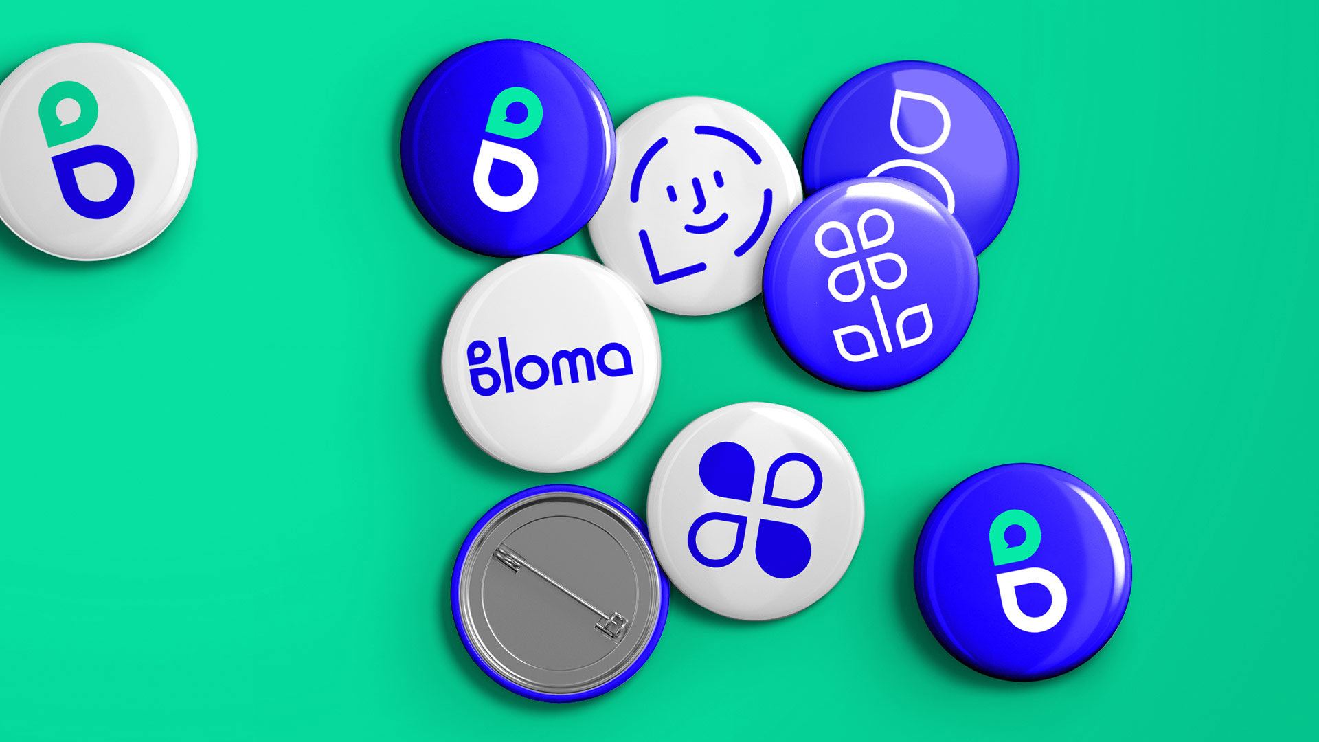
During discovery we identified that a speech bubble and a petal can look similar which would work well to reflect on the growth, community and discussion element of the app experience.
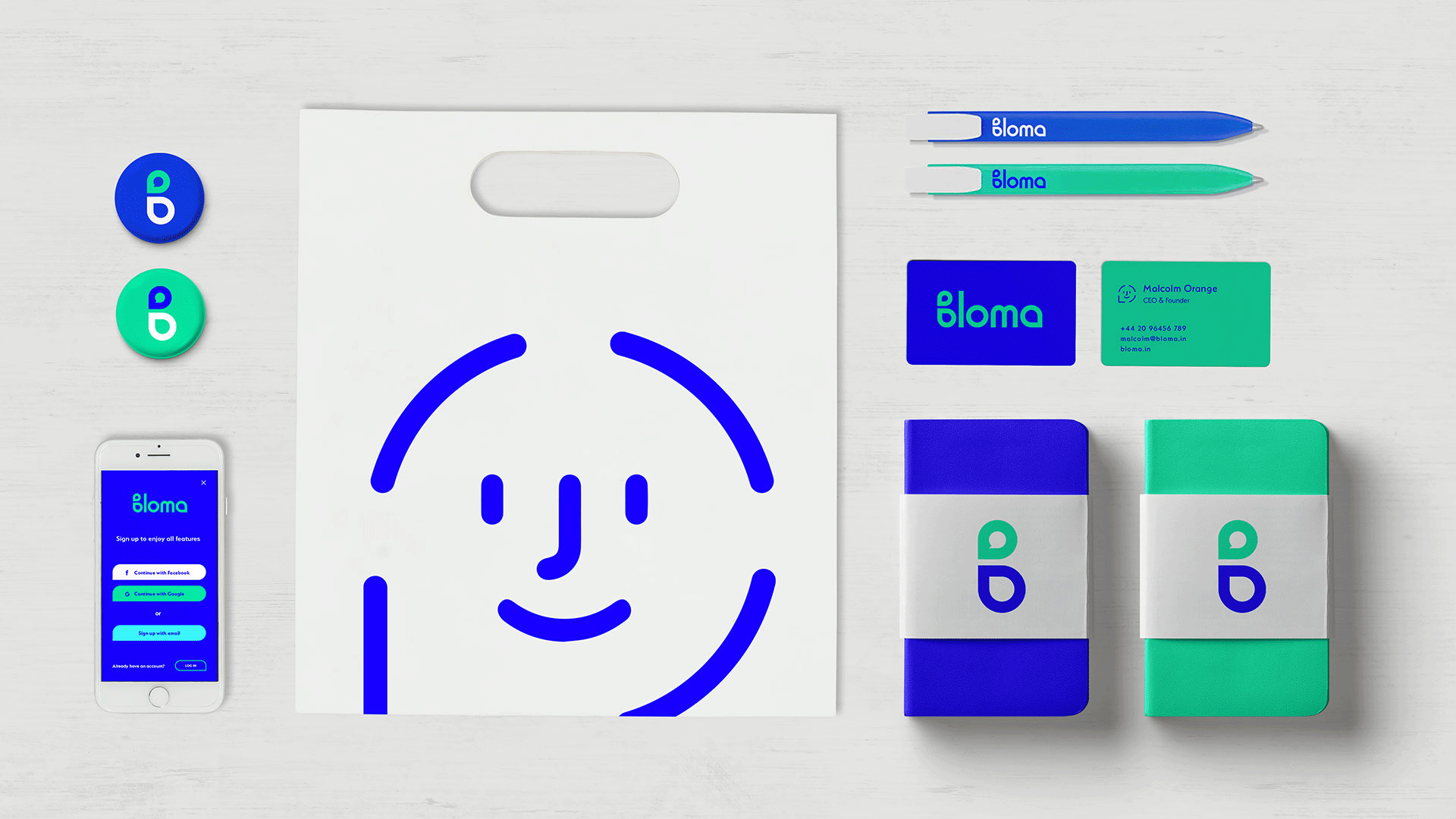
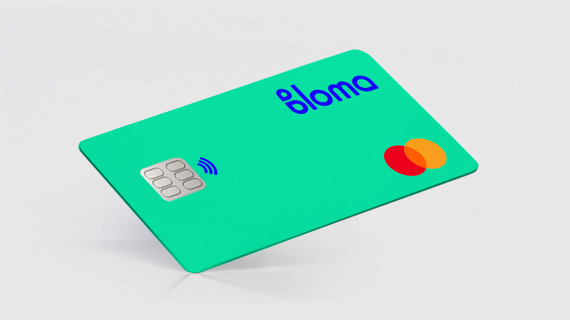
For Bloma we developed a logo design to represent and symbolise the initiative of the digital app and a brand identity to appeal to a new generation of remittances.
We created a bright flat contrasting colour scheme to create an uplifting and fresh user experience that breaks the norm for financial platforms.
We brought together two key aspects of the app to create an iconic, simple and striking brand mark, carefully designed to be used as both a wordmark and a logomark in a series of flexible colour ways.
This was used as part of an eyecatching, bold punchy brand identity to appeal to a new generation of remittencers.
Custom Iconography.
For the Bloma brand I crafted an extensive range of bespoke icons and an illustration style which would be used both in the app and as part of the brand look and feel.
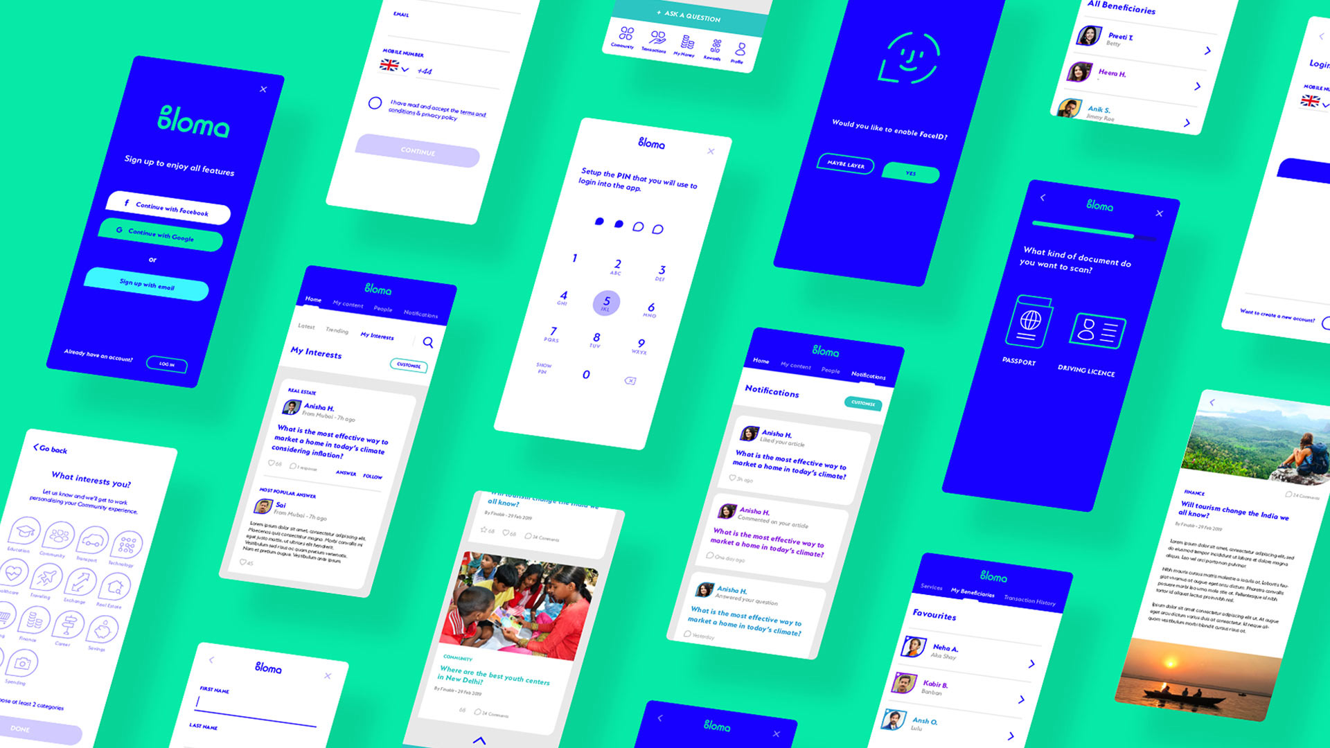
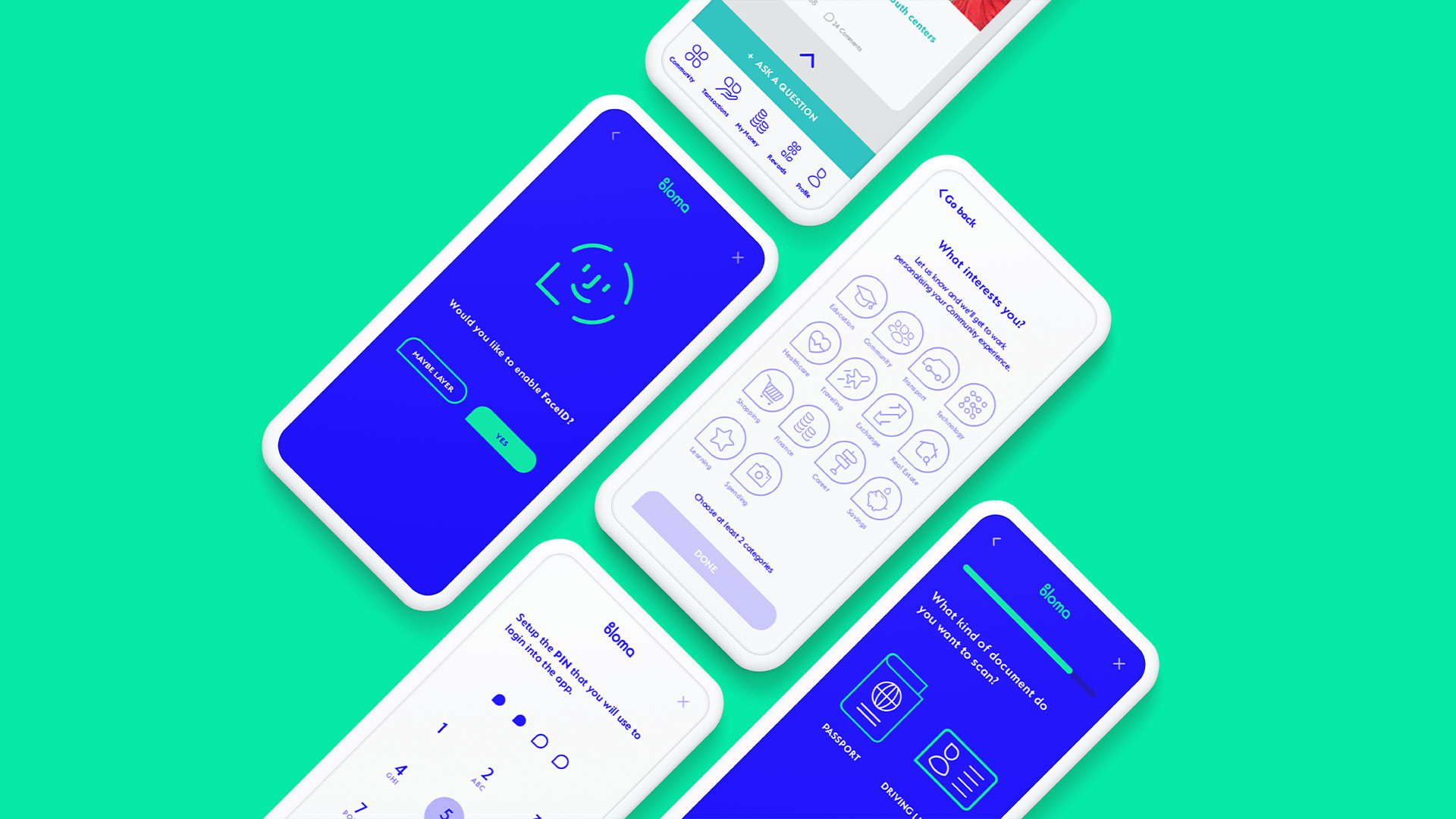
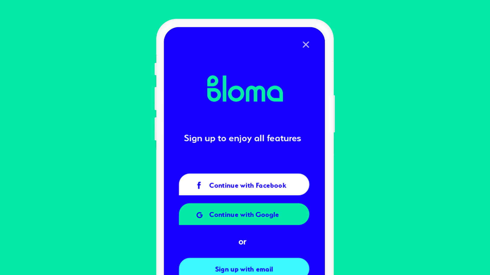
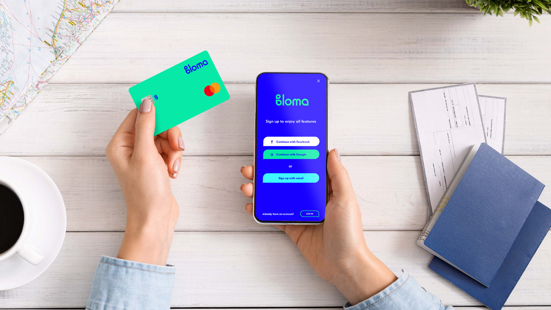
App UI.
Once the brand colours were established I also had to suggest ways the look and feel would be applied to the App UI.

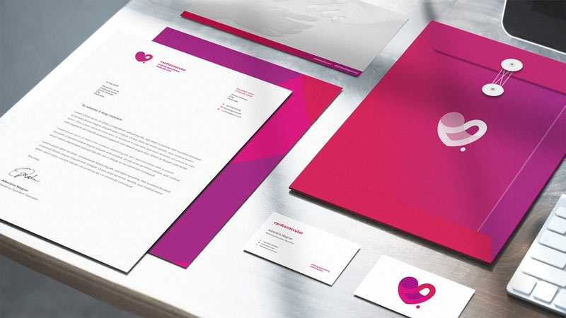
Cardiovascular.
Uniting Experience, Evolving Care.
Vigilate.
The Watcher.
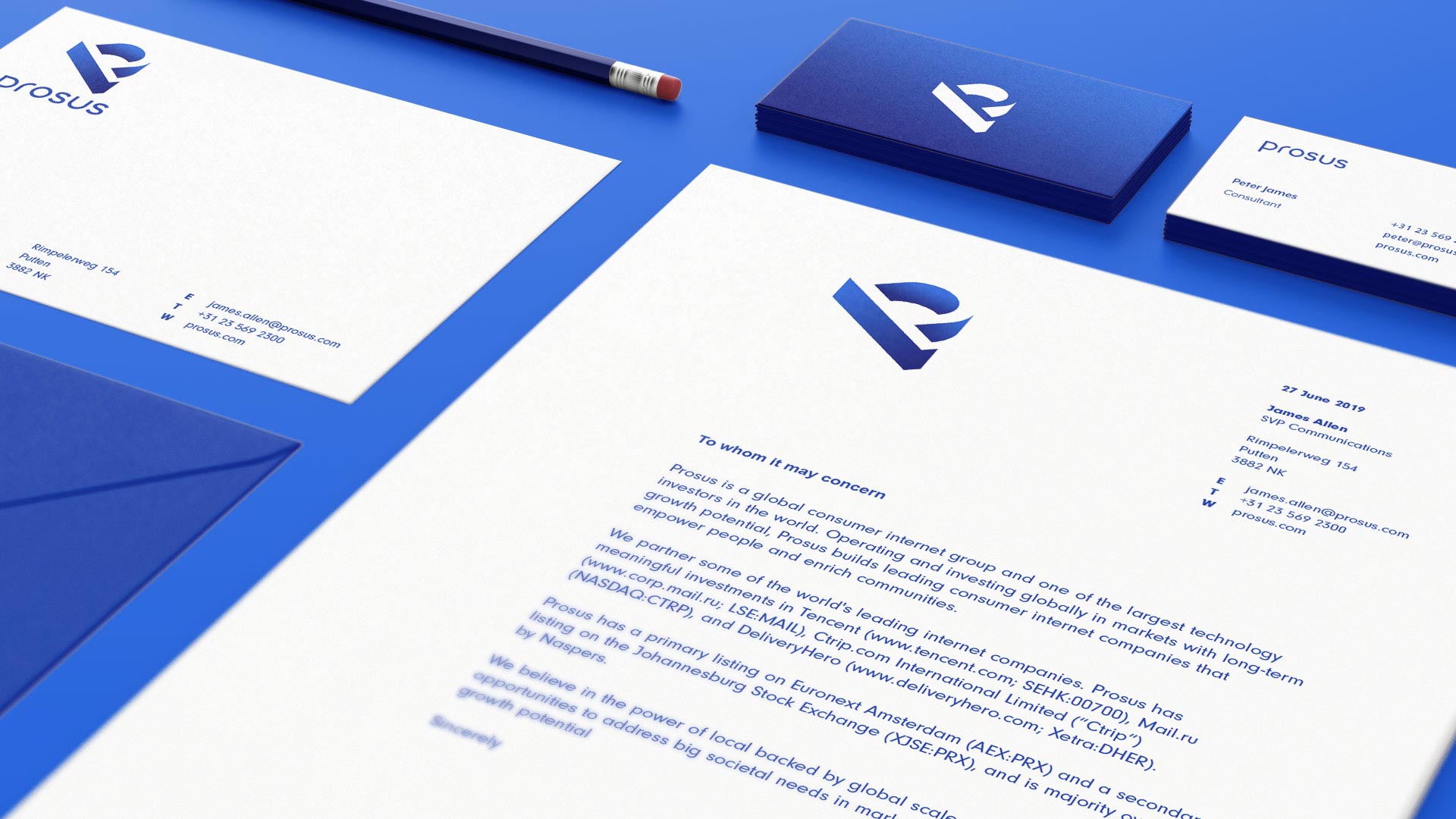
Prosus.
Elevating New Business.
Riverside Training Spalding.
Build Your Future Today.
Duel Speed.
20 Years of Success!
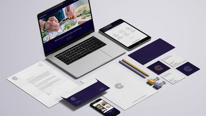
Concentriq
The Pathway To Your Potential.
145 City Road.
Retail Marketing Campaign.

The Chain.
Create Your Momentum.