


Captivating audiences for a motorsports world cup event!
We created a logo identity for one of the biggest motorsports world cup events.
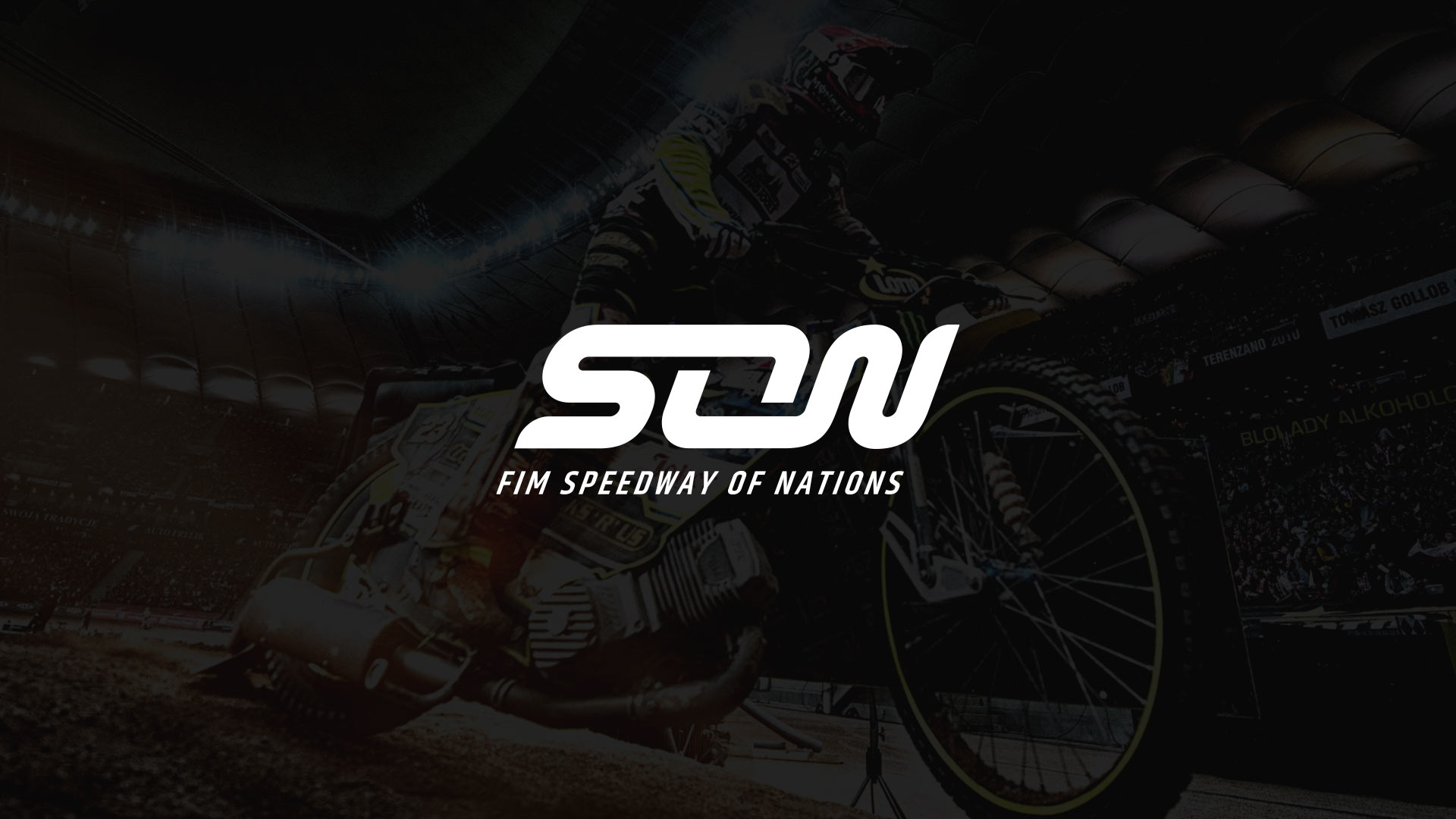
Speedway Of Nations.
The Need For Speed.
Strategy / Typography / Branding / Motorsports
Challenge.
We needed to develop a logo identity to captivate current and new audiences for a world cup motorsports event.
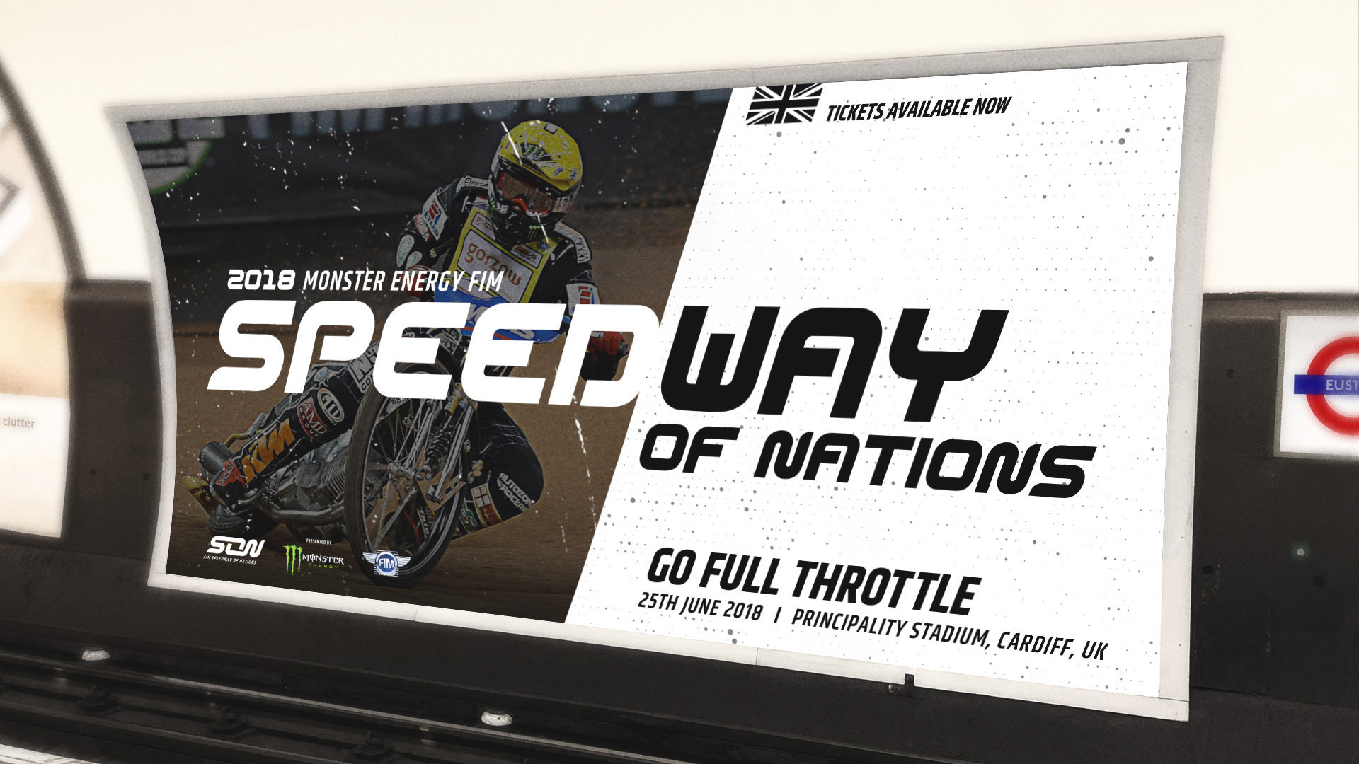
Speedway of Nations is a rebrand of ‘Speedway world cup’, a newly formed World Championship event. 15 nations compete head to head in a high octane week for the ultimate title of World Champions.
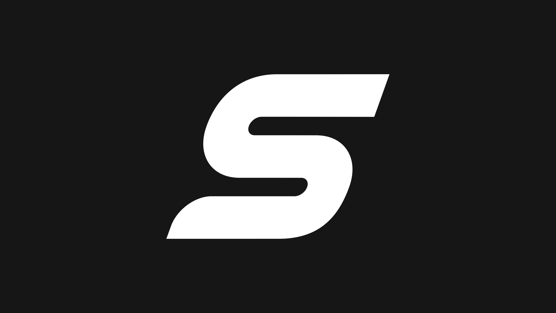
A fluid line.
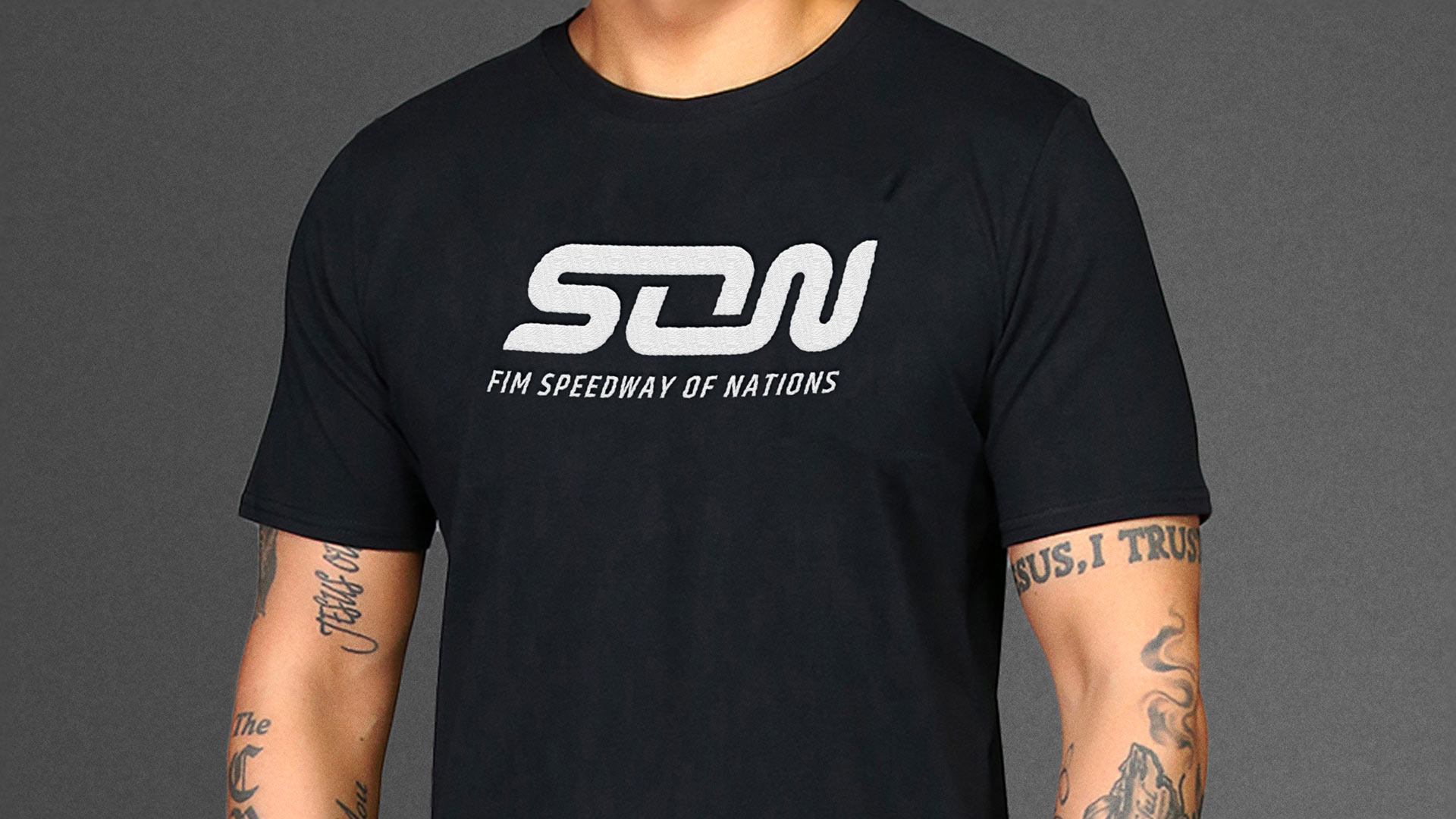
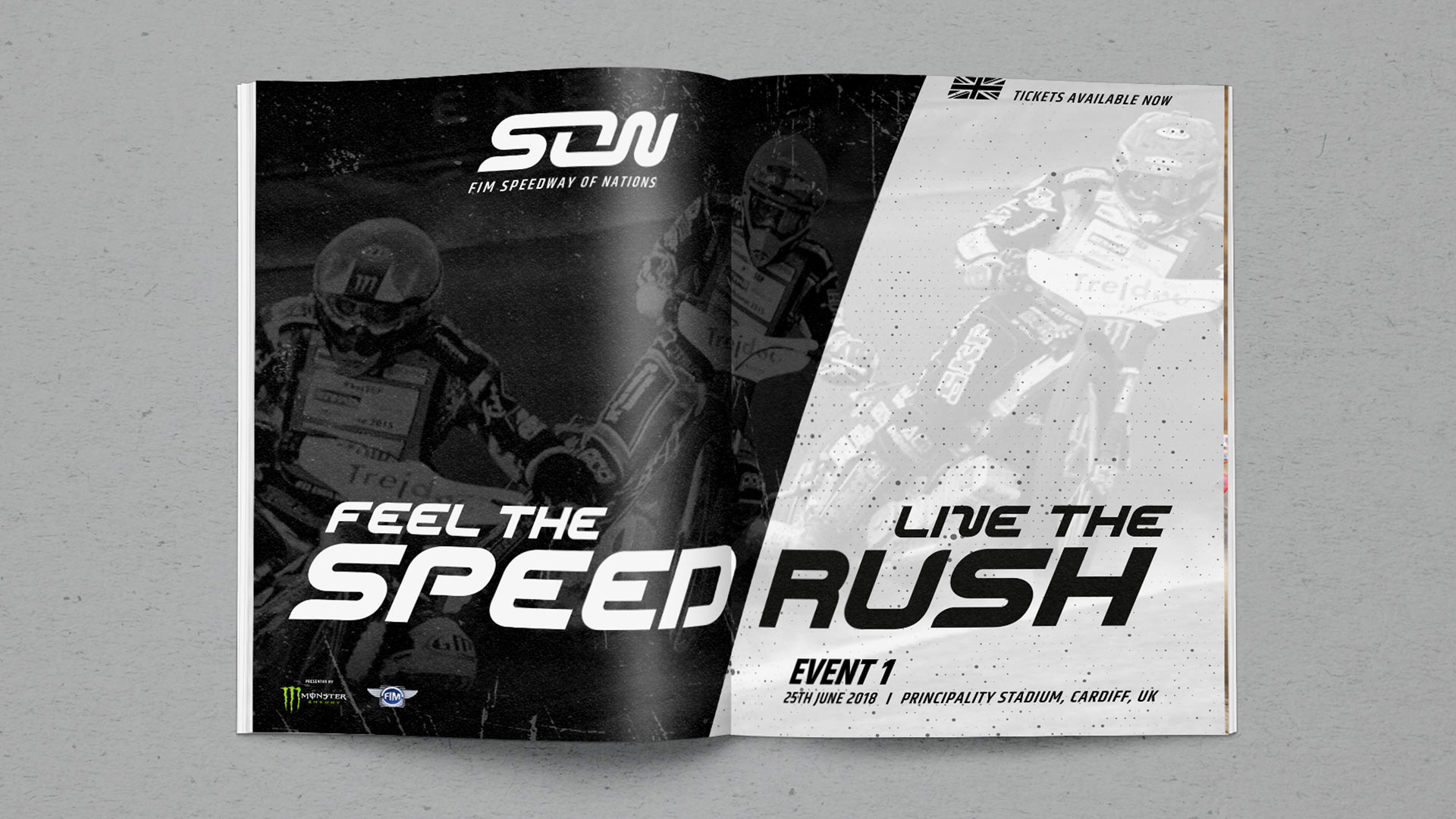
The lettermark logo symbolises the fluid motion, direction and momentum of the speedway race which orients around an oval track.
Unique to the Speedway of Nations race is the unity of two team drivers per race. This unit of two is also reflected in the lettermark.
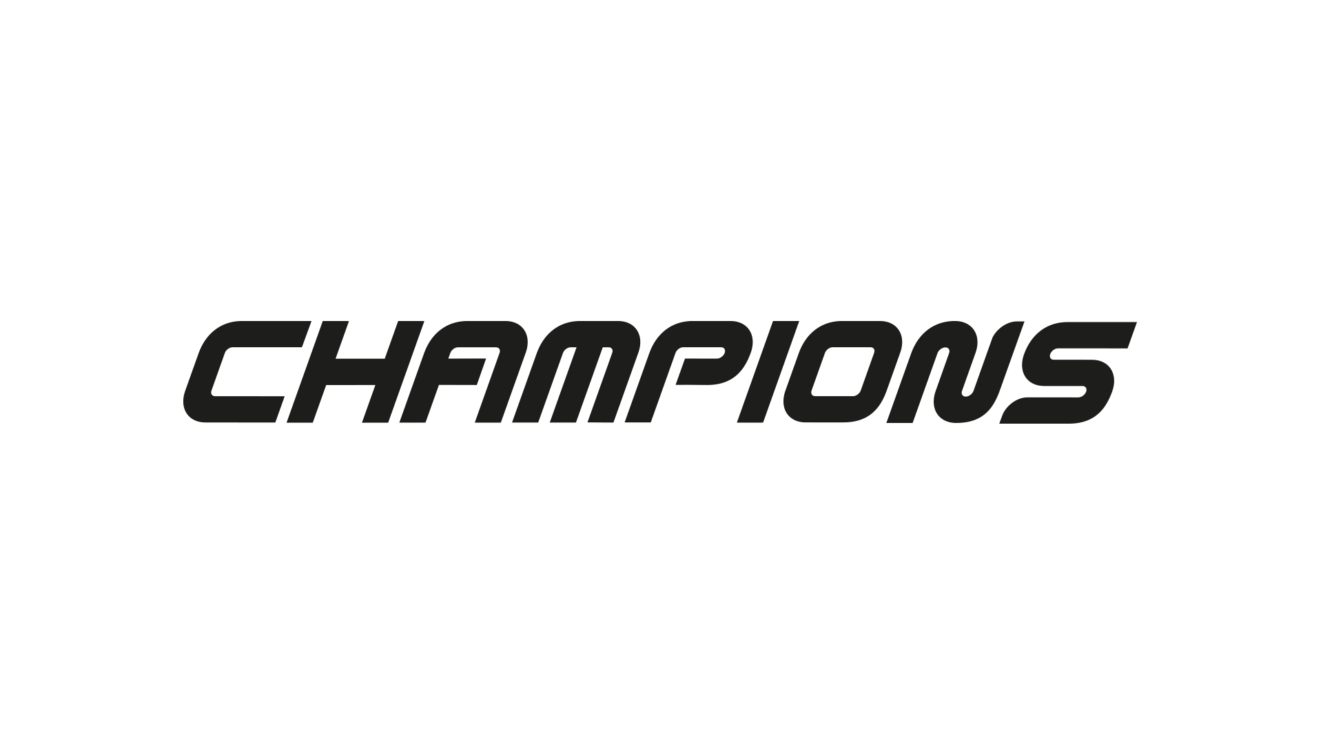
To create a distinct and memorable logo identity we designed and developed a custom typeface that we used to create the logo.
The typeface was characterised by the fluid motion, direction and momentum of the speedway race.
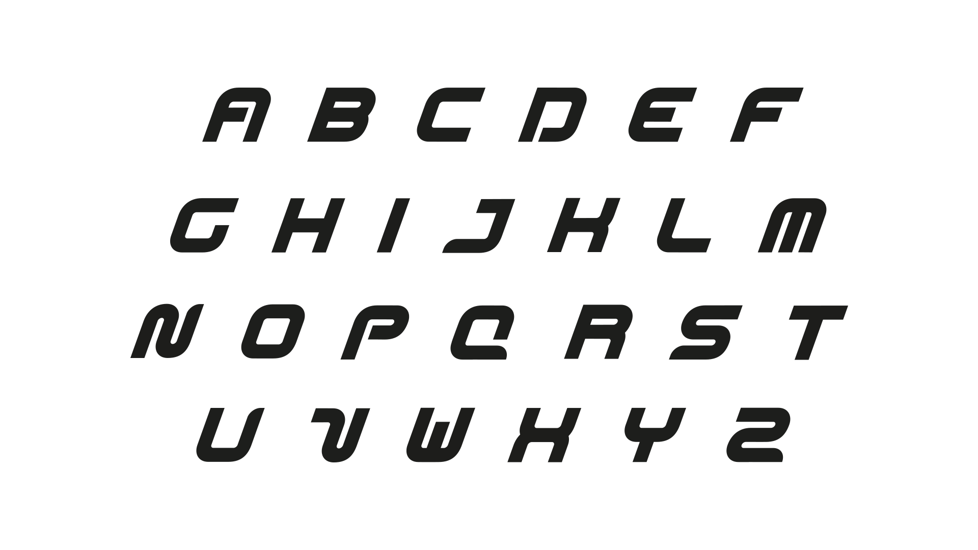
Bespoke Design.
The typeface offers distinct visual ownership to the Speedway of Nations brand.
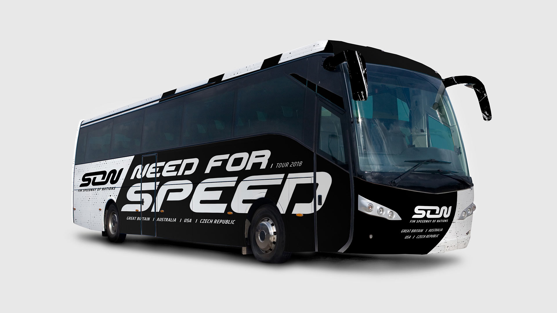
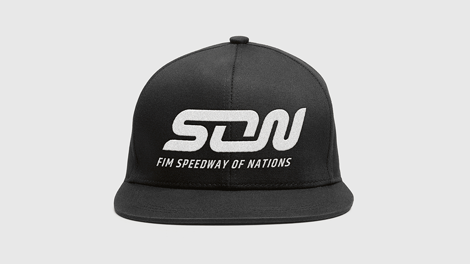
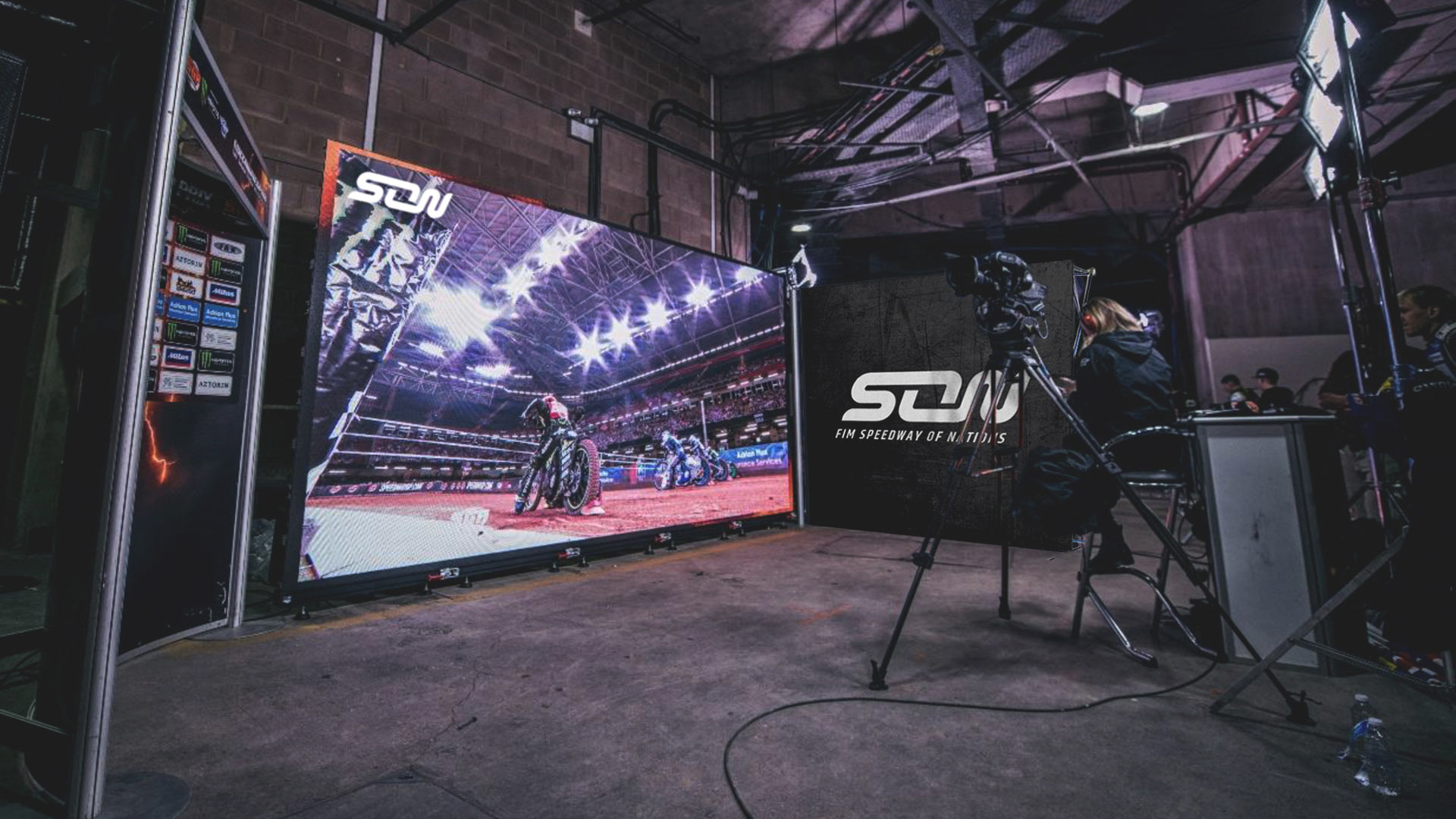
Full Coverage.
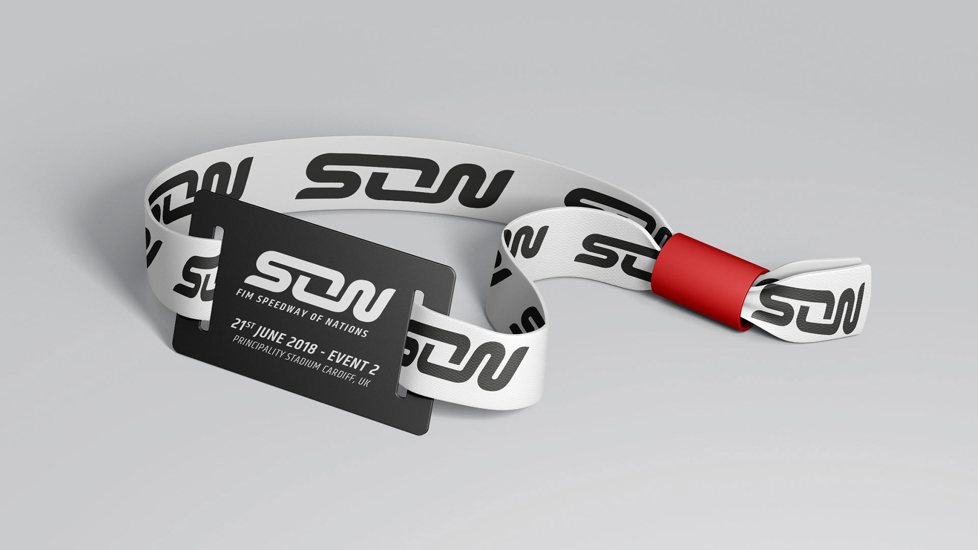
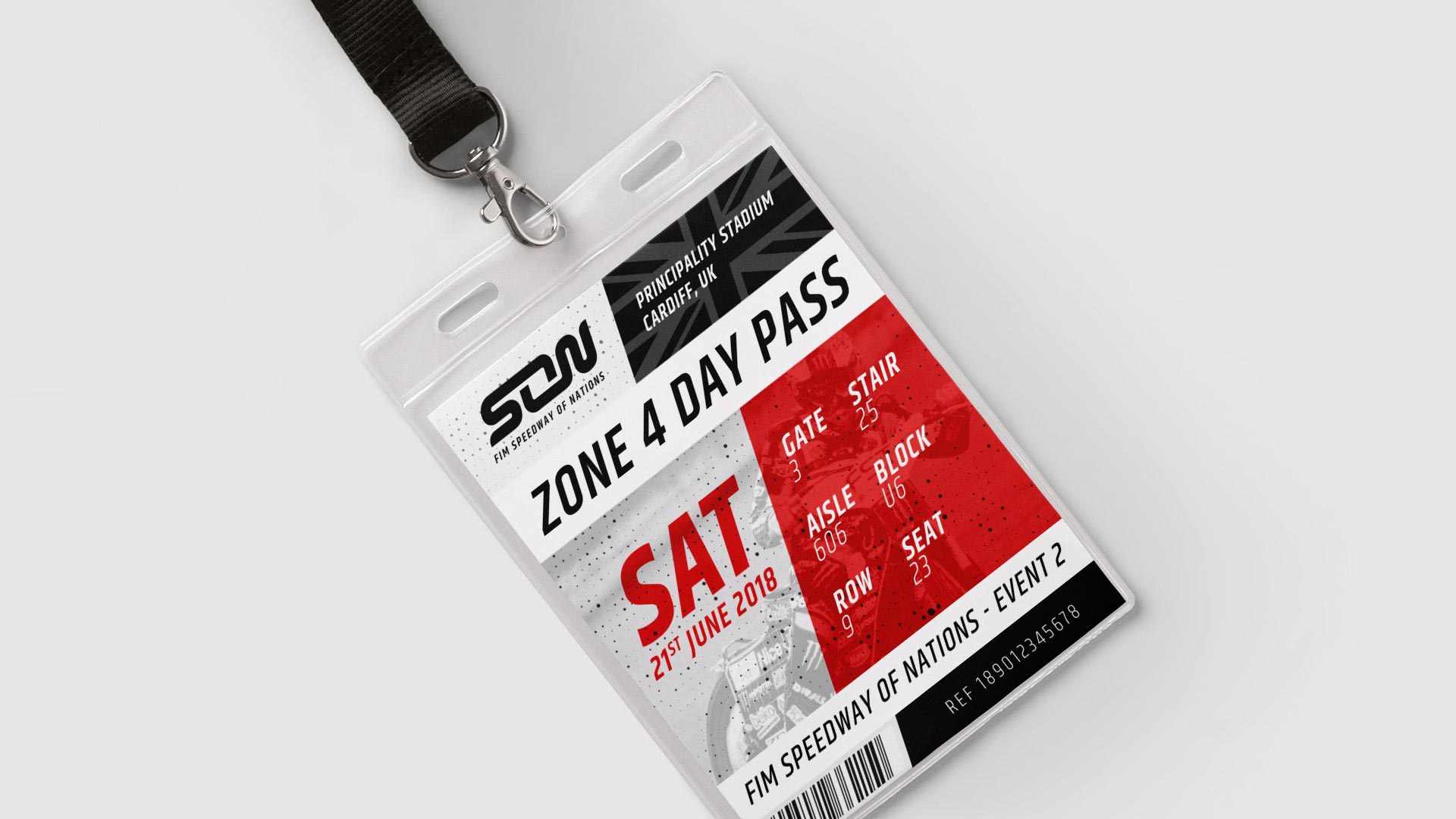
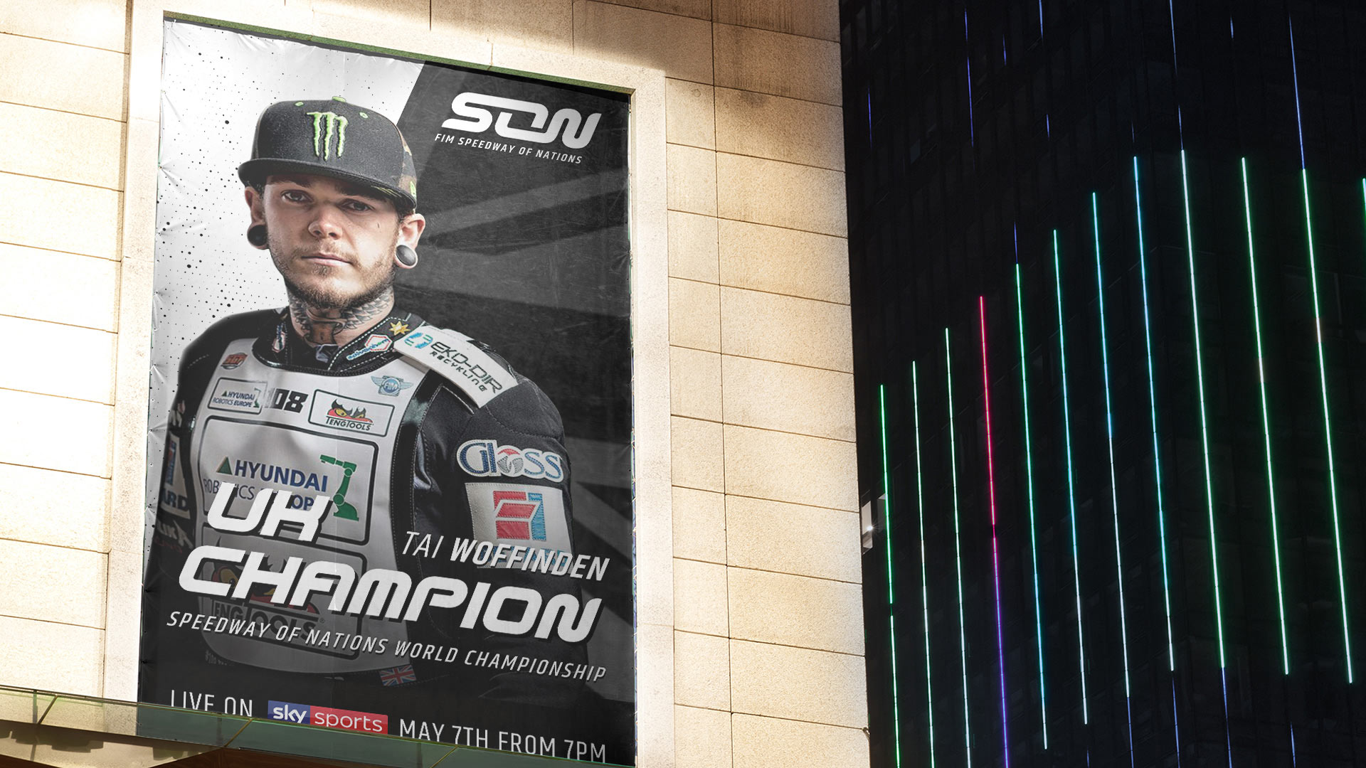
Logo features prominently across all platforms both in the arena and TV, online and on merchandise.
Full Coverage.
The typeface would be used as a prominent brand element in synergy with background compositions to create impactful advertisement.
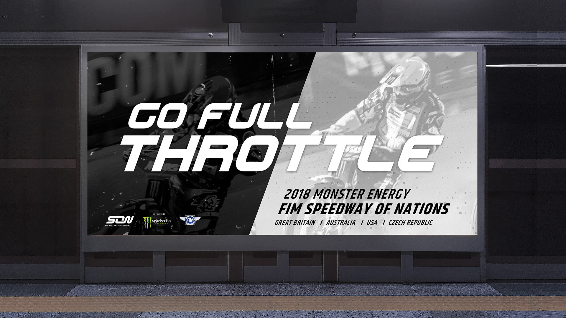
The new face of the Speedway World championship, used across all platforms both in the arena and TV, online and on merchandise.
A fresh and modern aesthetic that celebrates what makes Speedway of Nations truly unique and exciting by reflecting the unity of the fanbase, the unity of the team and the sport as a whole.

Cardiovascular.
Uniting Experience, Evolving Care.
Bloma.
Remittance App Branding.
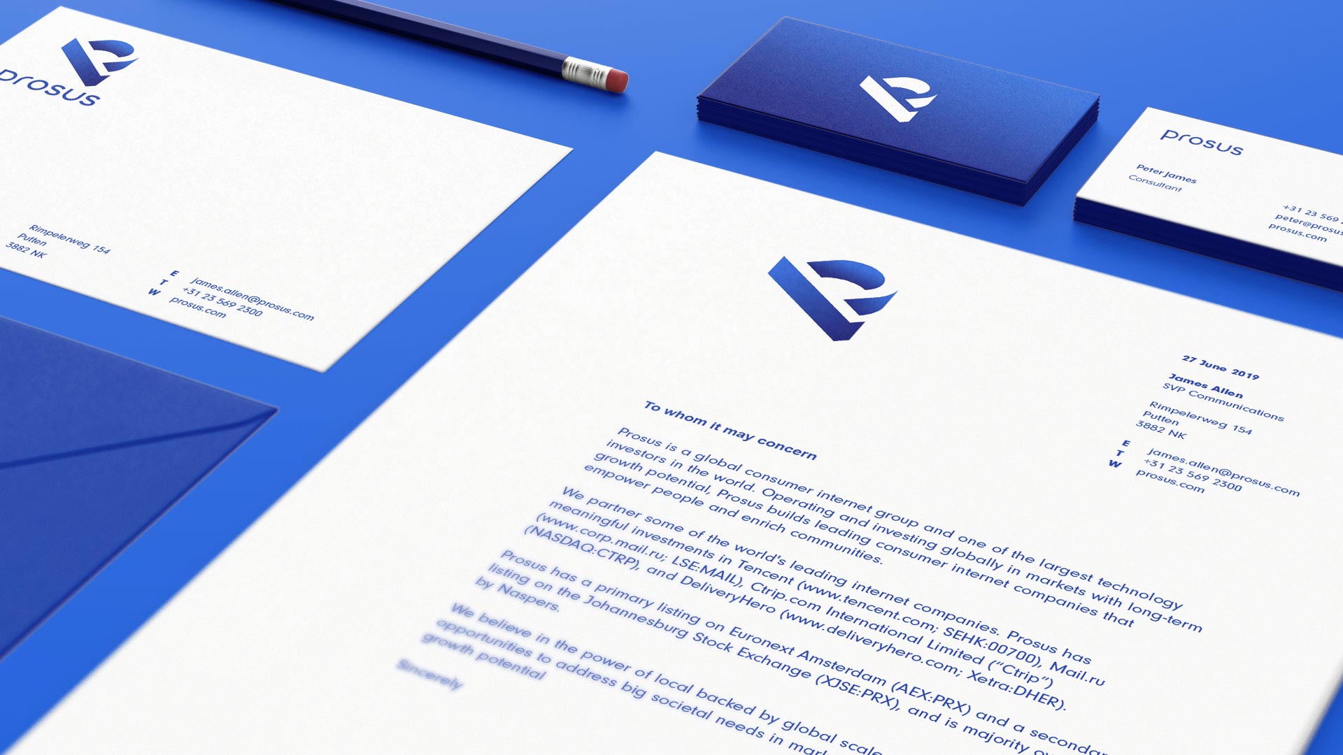
Prosus.
Elevating New Business.
Riverside Training Spalding.
Build Your Future Today.
Duel Speed.
20 Years Of Success!
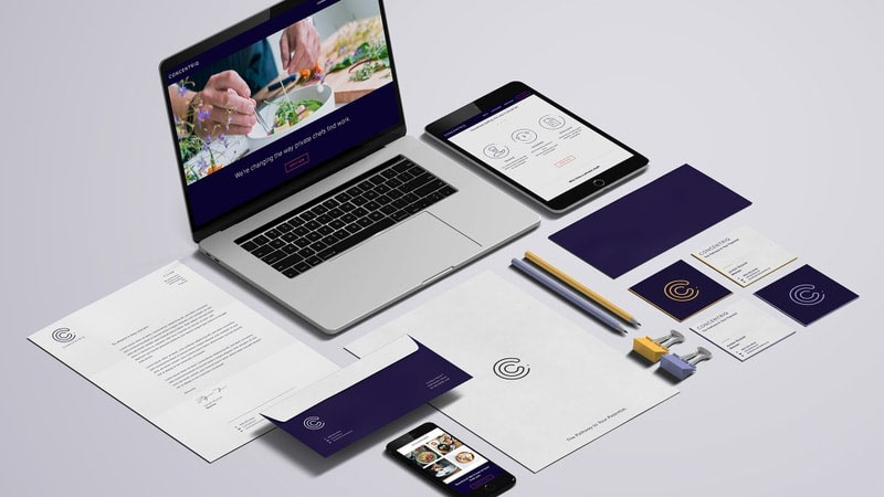
Concentriq
The Pathway To Your Potential.
145 City Road.
Retail Marketing Campaign.

The Chain.
Create Your Momentum.